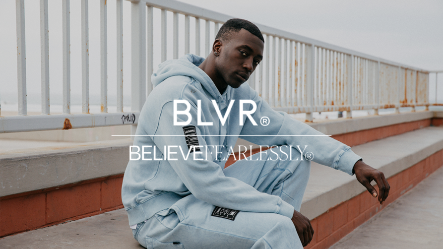
Joywell


“BLVR brought the Joywell brand to life in the most authentic way. They’re visionaries who implement their creative skills and industry expertise. Seamless collaboration is a hallmark of their work.”
— Thuy Vi Vu, Founder
Overview
01
When entrepreneur Thuy Vi Vu came to BLVR, she had a dream of opening a collection of boutique hotels geared toward the millennial business traveler—a population that wasn’t being prioritized in the hospitality world. She knew it needed to be an experience unlike any other hotel, designed around an innate understanding of its customer base and thoughtfully curated to help them find joy in the business travel experience. Everything about the brand, from its name to the website to the physical property itself, needed to be built from the ground up.
Brand Strategy - Brand Positioning
02
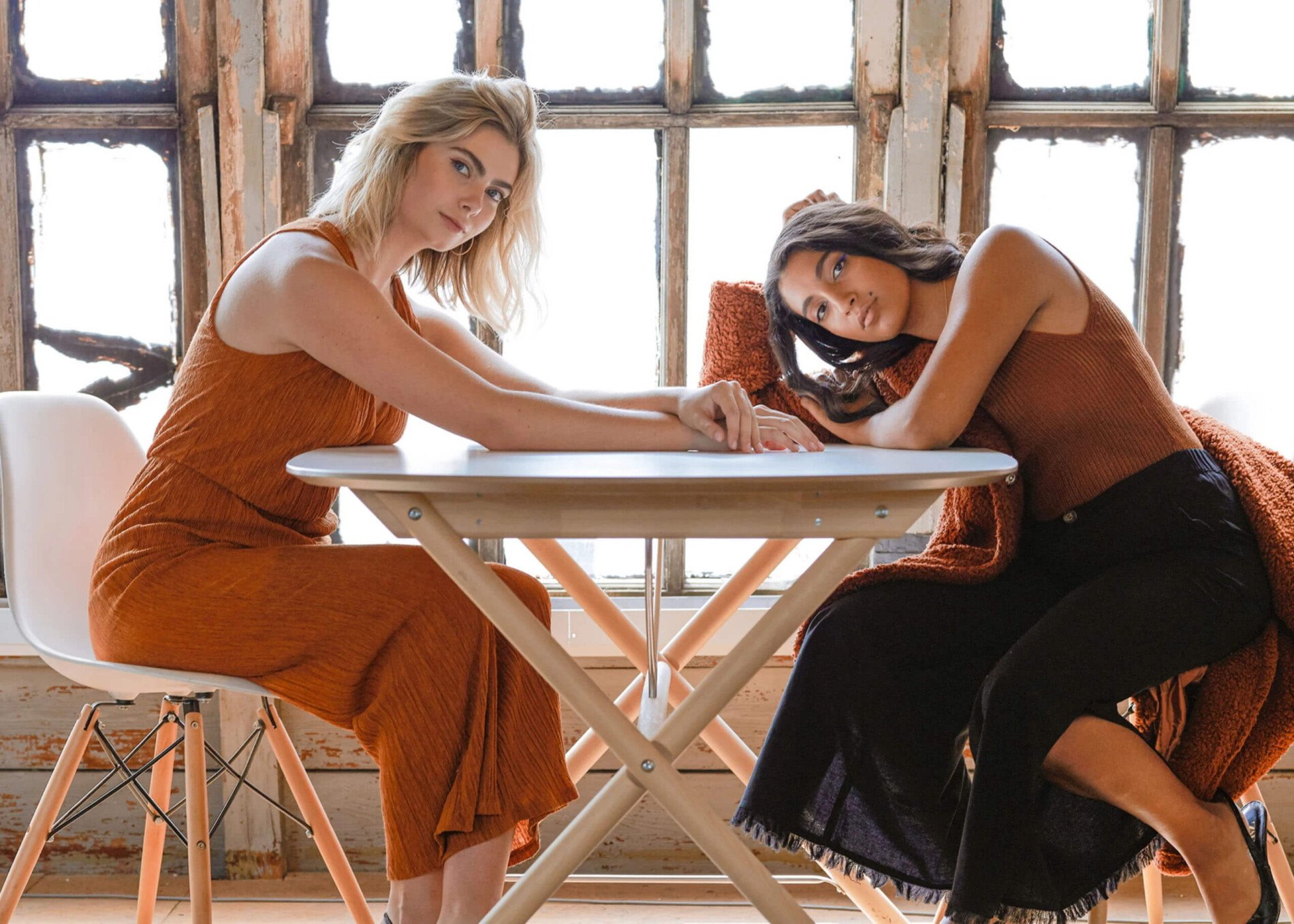
From our audience research, we knew that the millennial business traveler is seeking relief from the strains of business travel but finding themselves in an industry that really only looks to solve functional conveniences. In order to disrupt the market, we would need to create an experience built around true personalization and delivering on emotional needs. The ultimate goal was to bring our audience joy, something they were seeking deep down but hadn’t previously associated with traveling for business. We built the brand positioning around the belief that joy makes life better, whether it’s expected or serendipitously through unintentional moments. We would give our guests the compassion and individualized attention they deserve throughout every step of their journey, taking care of not just their functional needs but the emotional ones as well.
Brand Identity - Naming
03
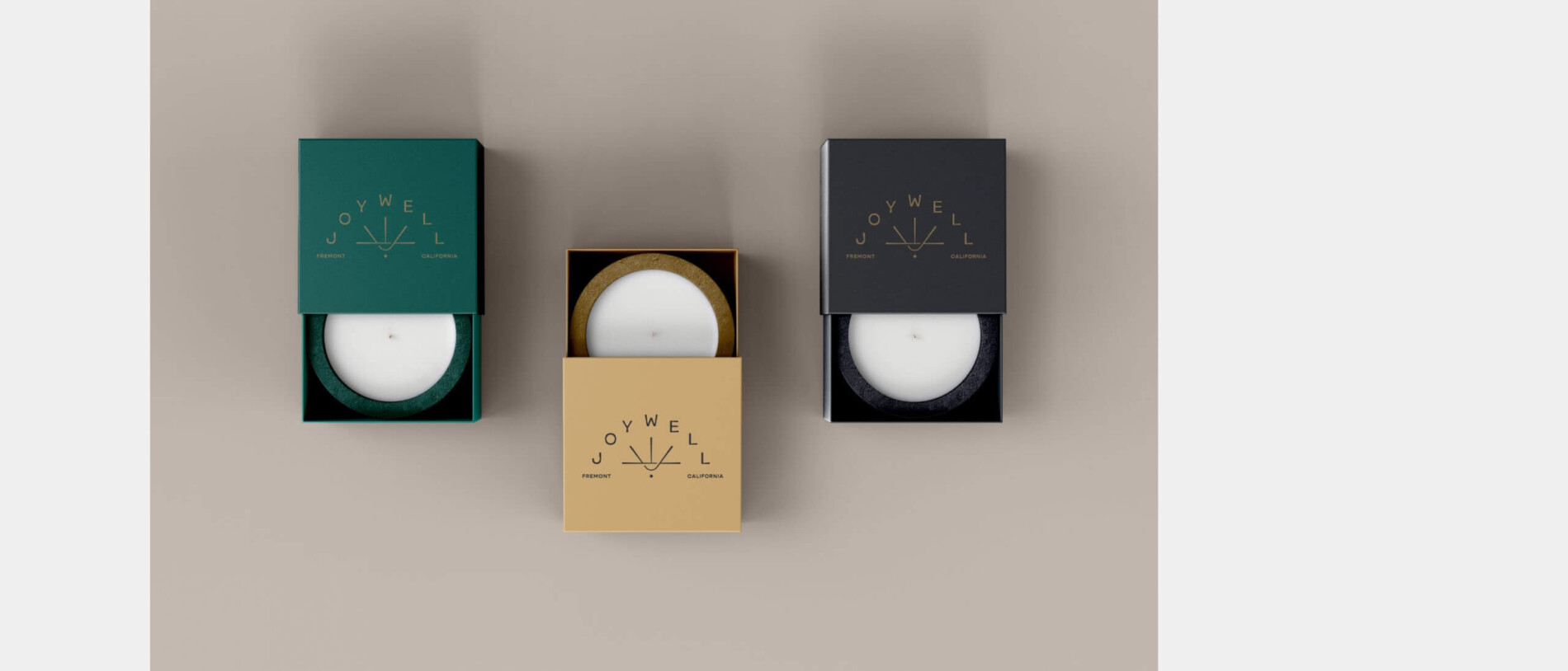
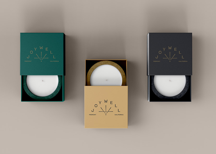
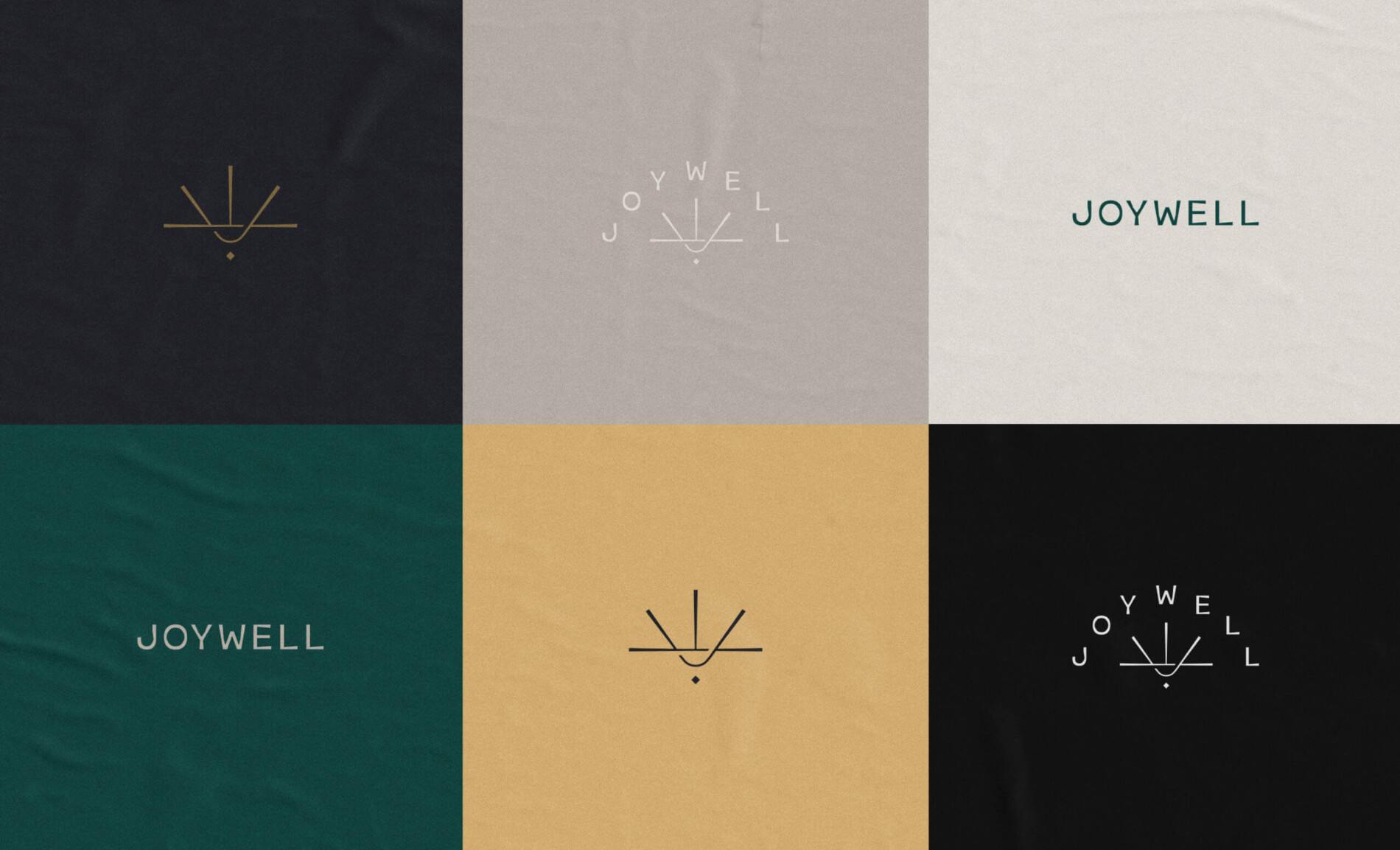
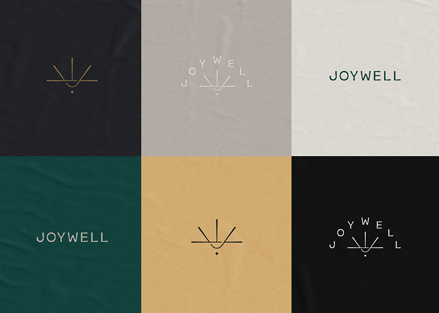
Brand Identity - Logo
04
As with the other brand elements, the journey to create a logo for Joywell was rooted in bringing the emotion and spirit of the brand to life in an expressive way. The icon uses the letters “J” and “W” to form a visual of the sun rising at the horizon, symbolizing new opportunities and seizing the day. It’s grounded yet aspirational, honest yet hopeful. The wordmark is crafted from custom letterforms that appear notched or grooved at the stems, which feel personal and warm, just like Joywell. The logo represents our vision to bring more joy to the world and our commitment to shining light, elevating our guests’ journey, and guiding them toward new experiences and possibilities.
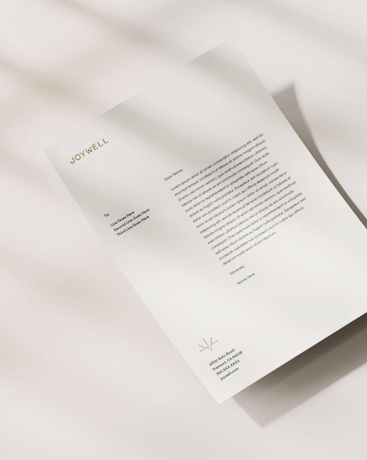
Brand Identity - Art Direction
05
As the guide for all visual expressions of the brand from social to website to on-premise, the art direction needed to feel distinct and memorable, and uniquely Joywell. The color palette we selected was handpicked to inspire optimism, hope, and joy. We paired bright colors alongside earthier tones to maintain a grounded, down-to-earth look and feel. When it came to typography, we selected two typefaces: Gopher and Sophia Pro. Gopher is a reverse contrast sans serif typeface that delivers a hint of quirkiness and curiosity, while Sofia is a beautifully crafted geometric sans serif typeface that feels soft-spoken, straightforward, and reliable.