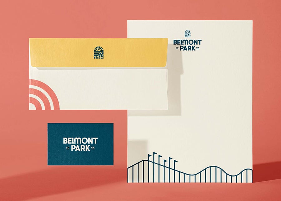
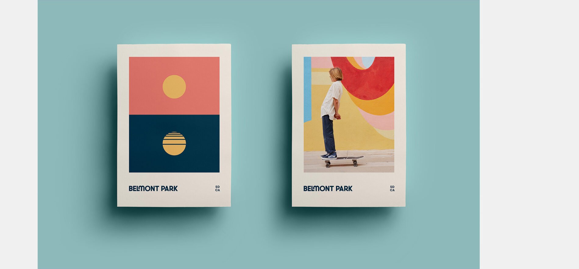
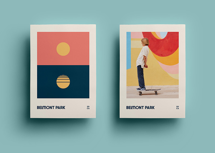
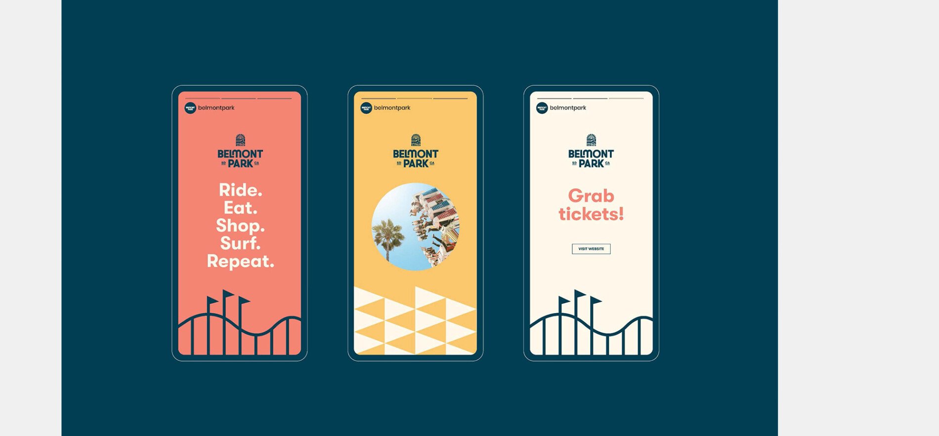
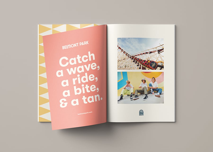
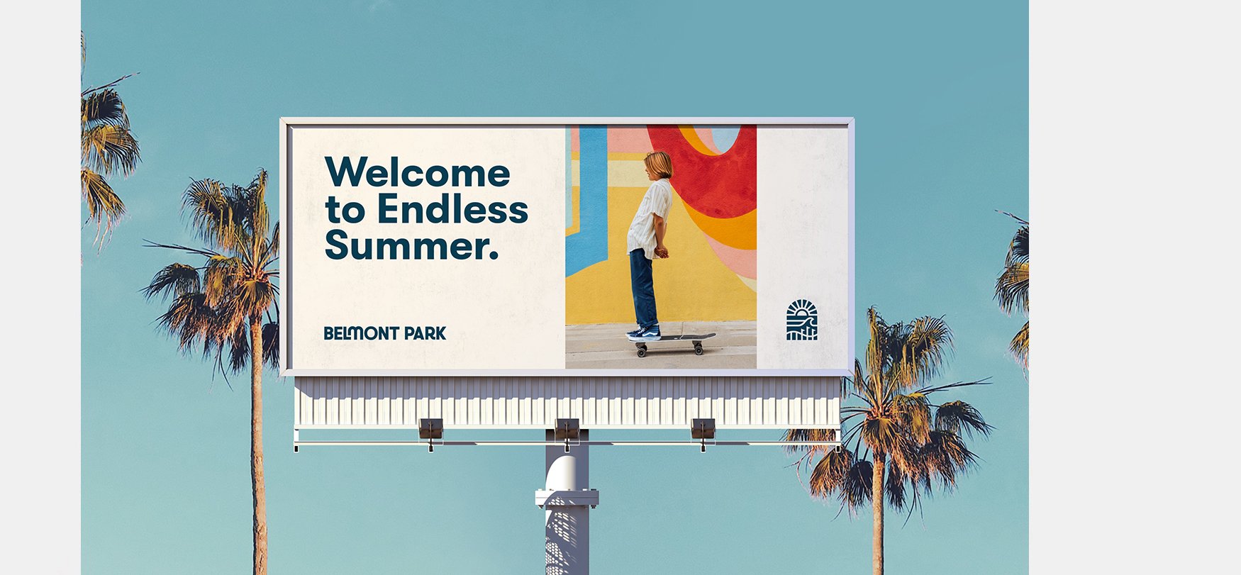
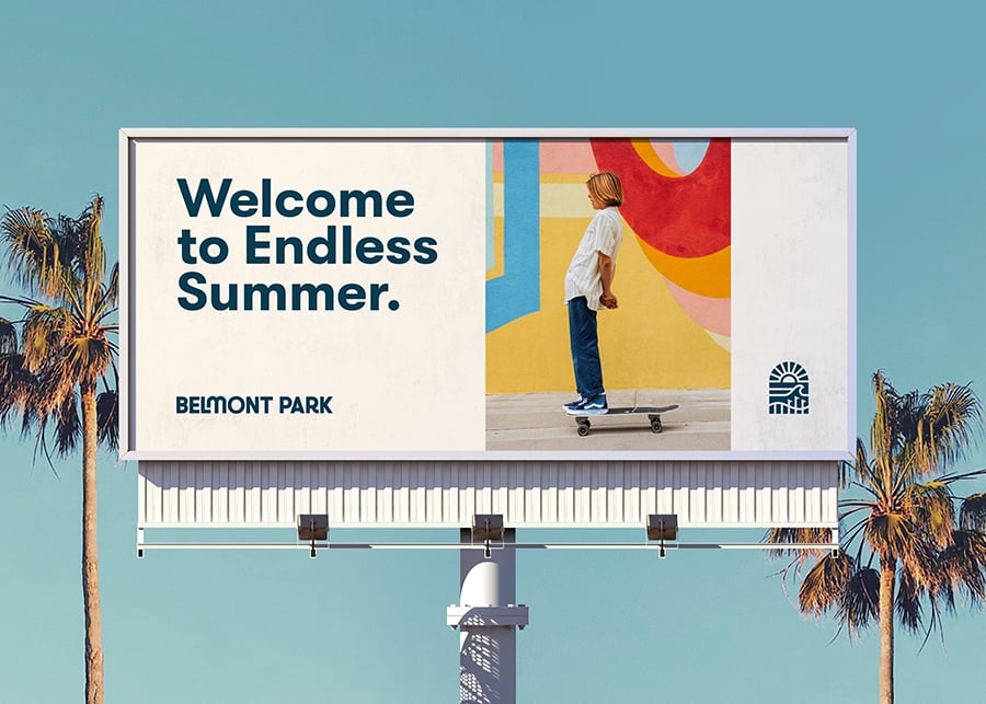
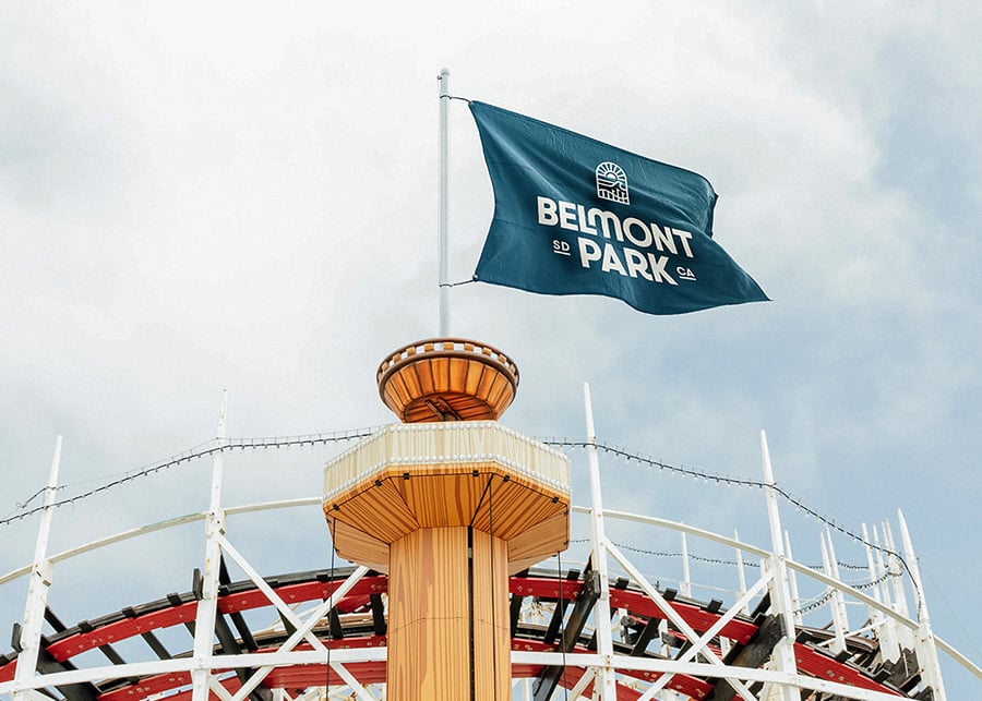
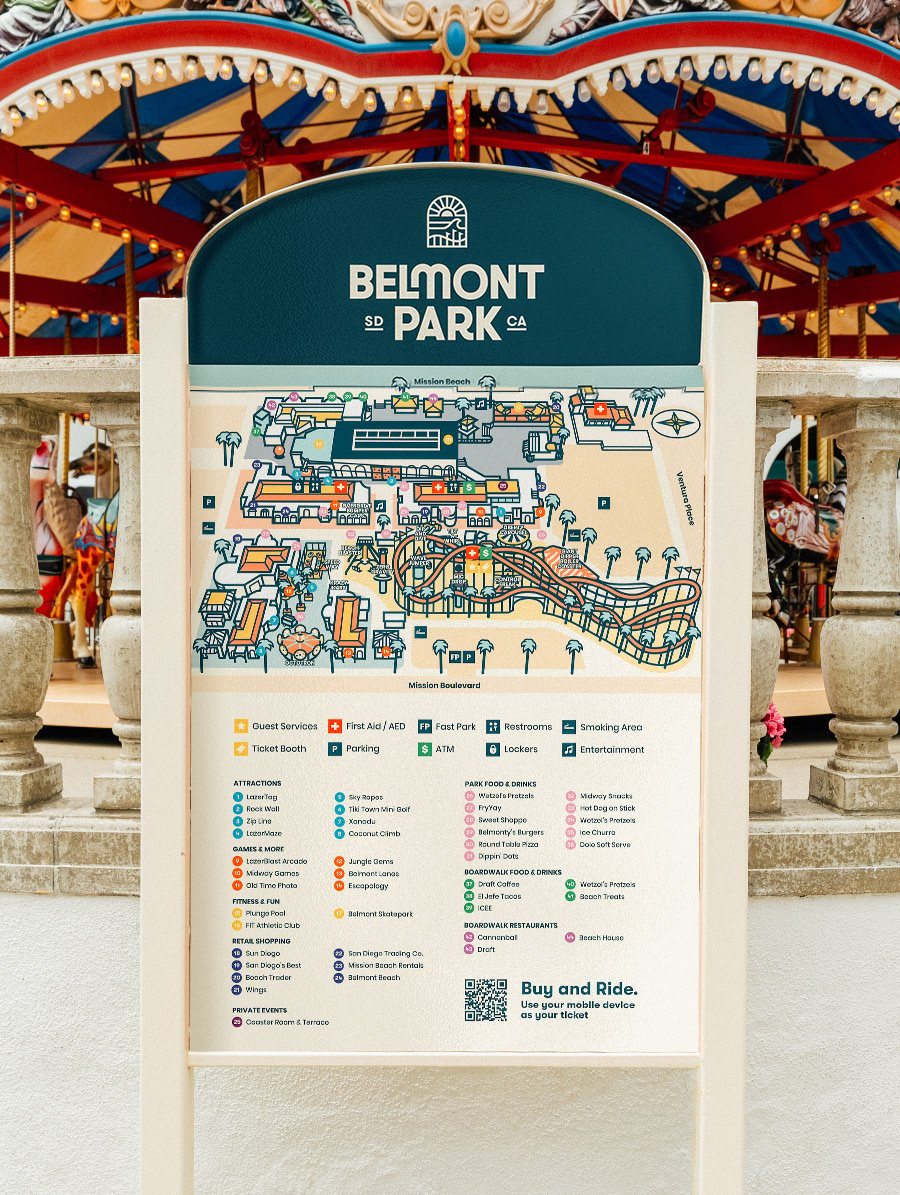
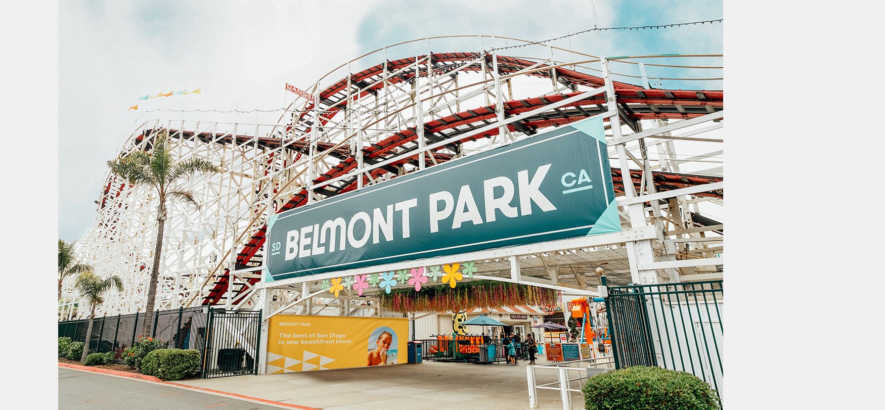
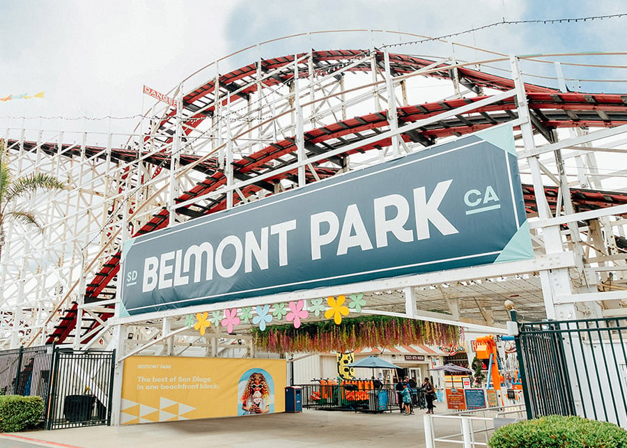
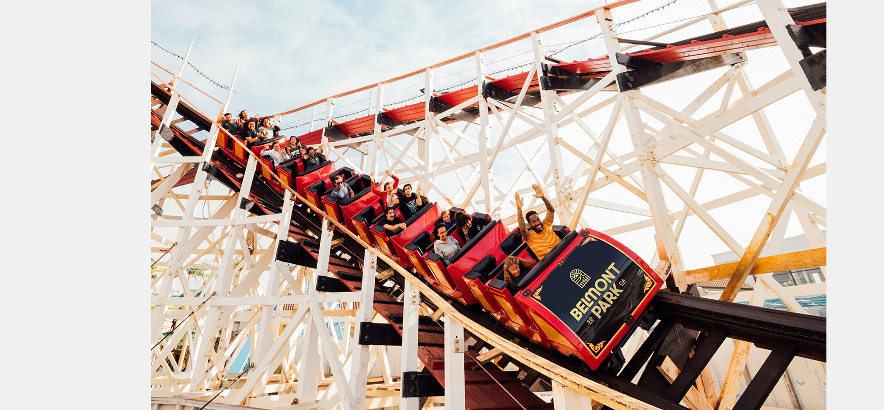
As San Diego’s only boardwalk, beachside destination, we wanted to bring their belief in San Diego’s unique culture to be brought to life through a unique identity. We wanted a modern brand that could last for decades to come, while also calling back to classic decades that embodied San Diego’s culture and made it a worldwide destination: from surf culture in the 60s to skate culture in the 70s and 80s.
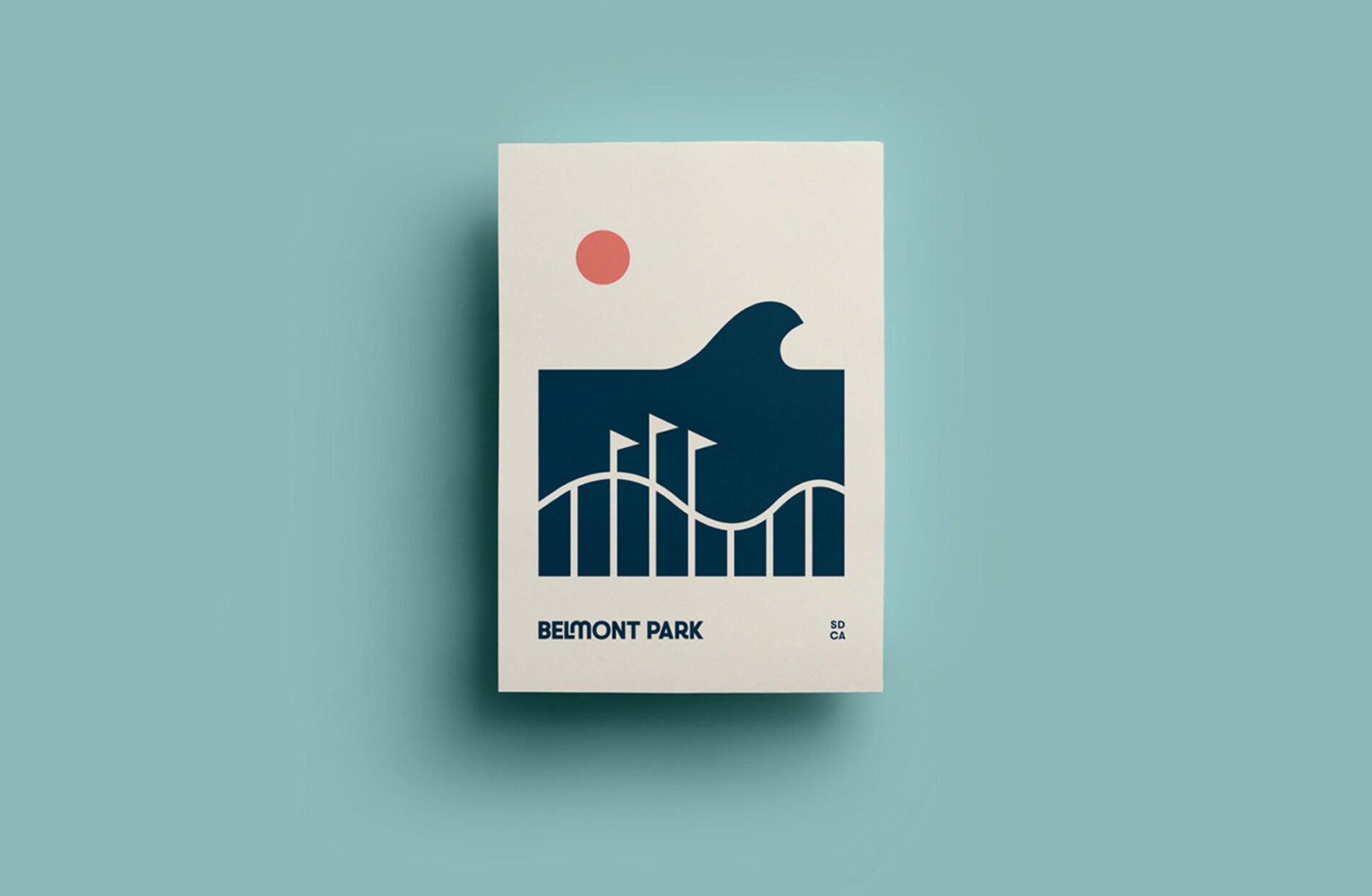
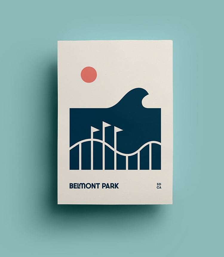
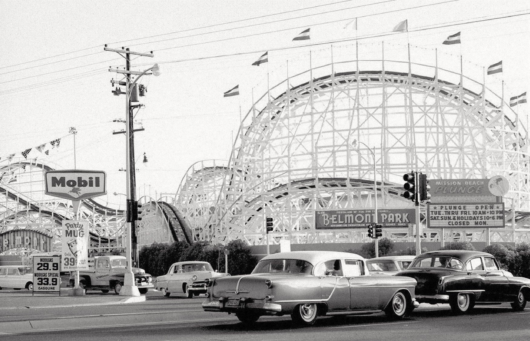
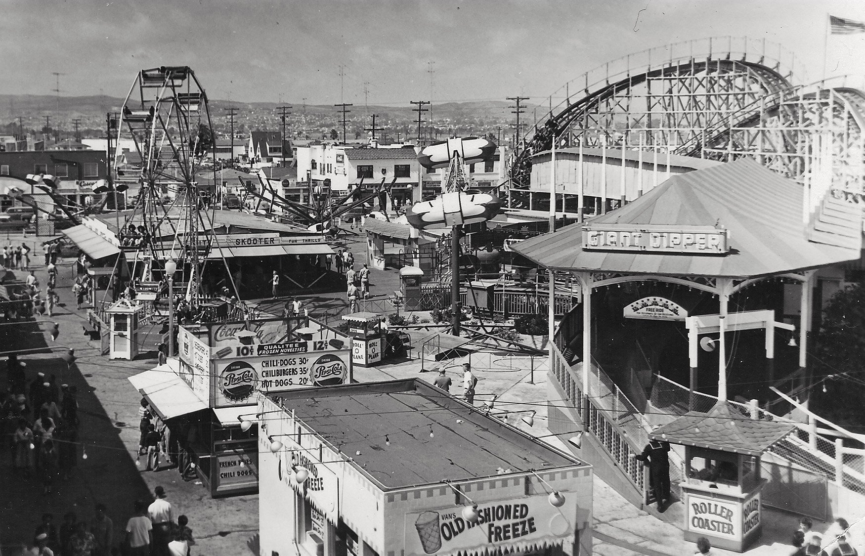
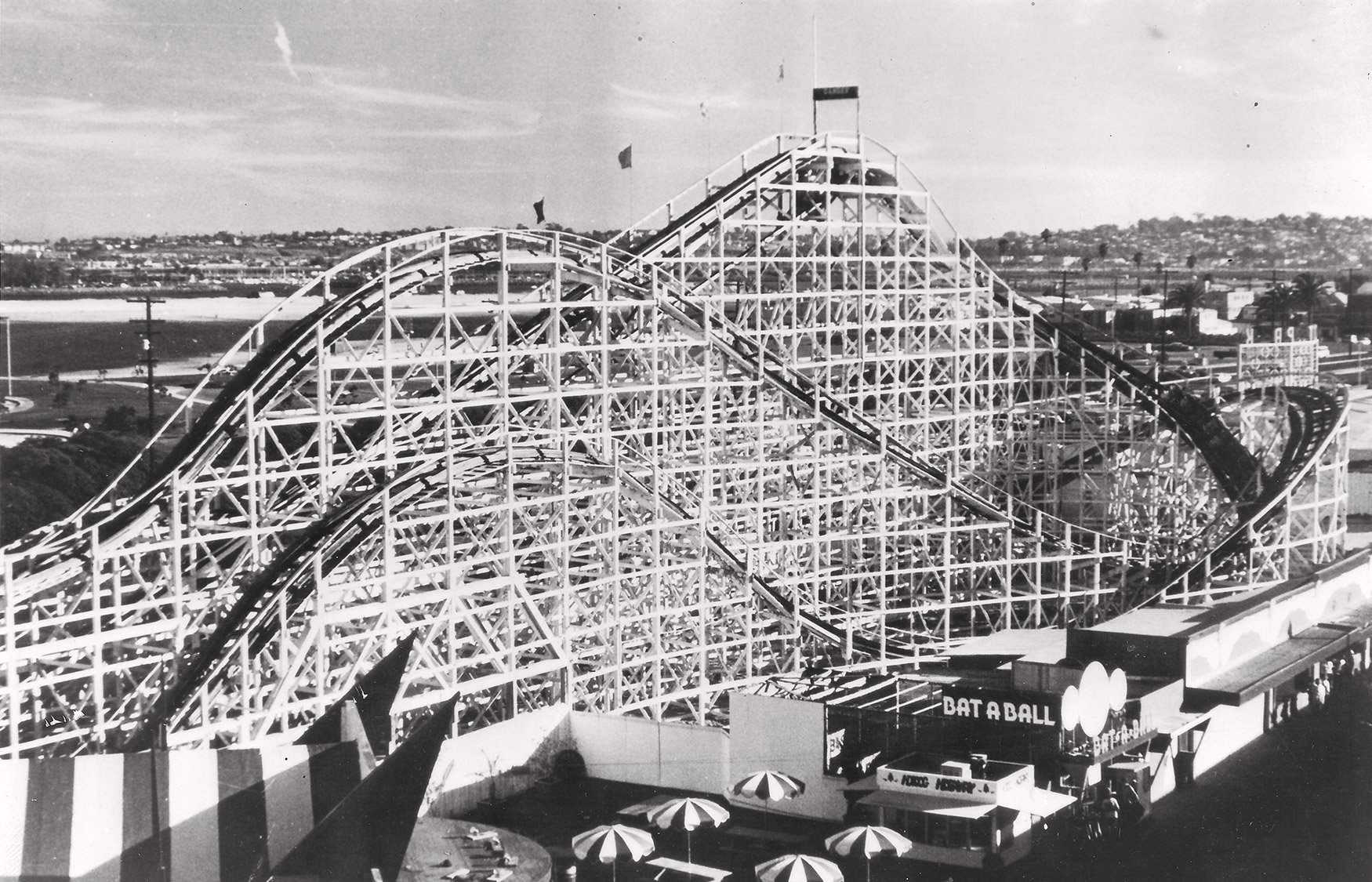
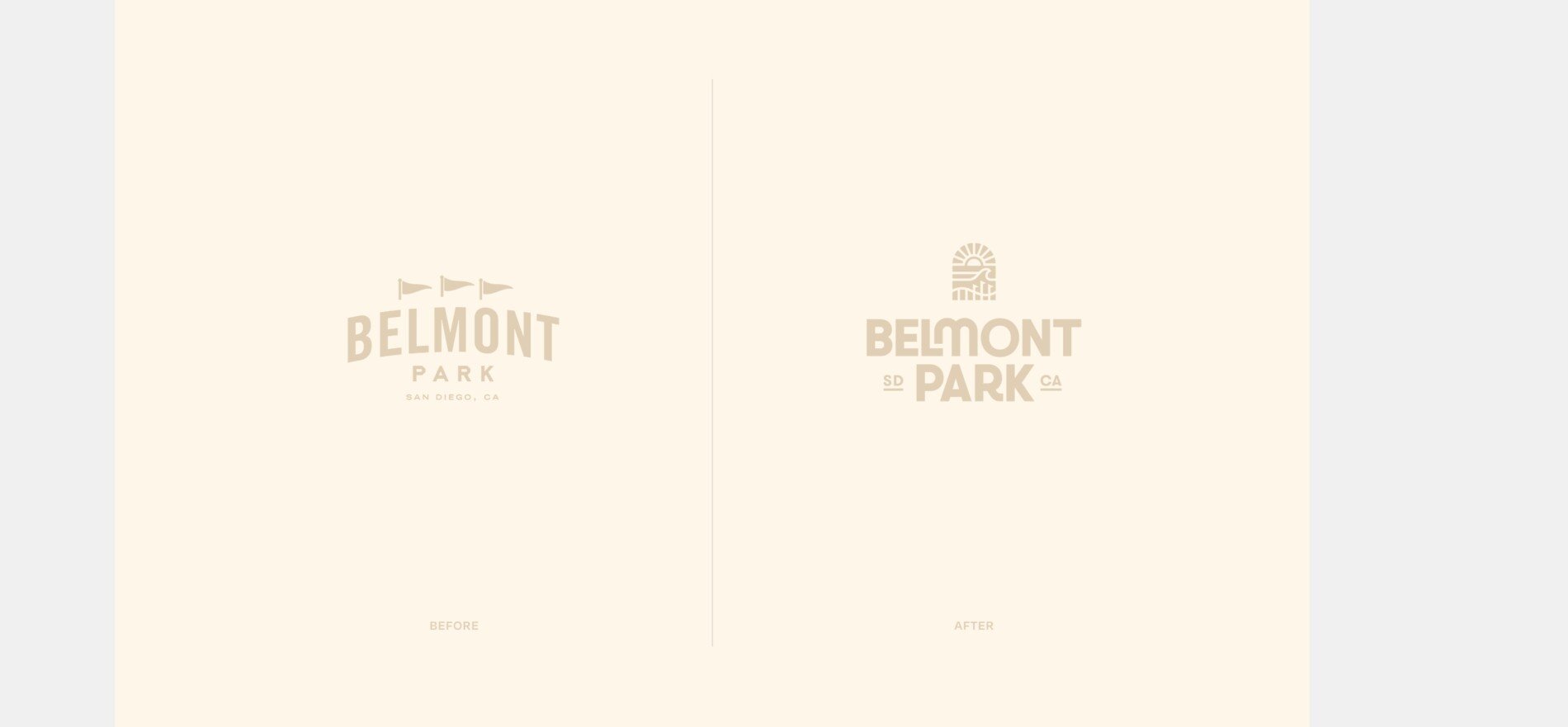
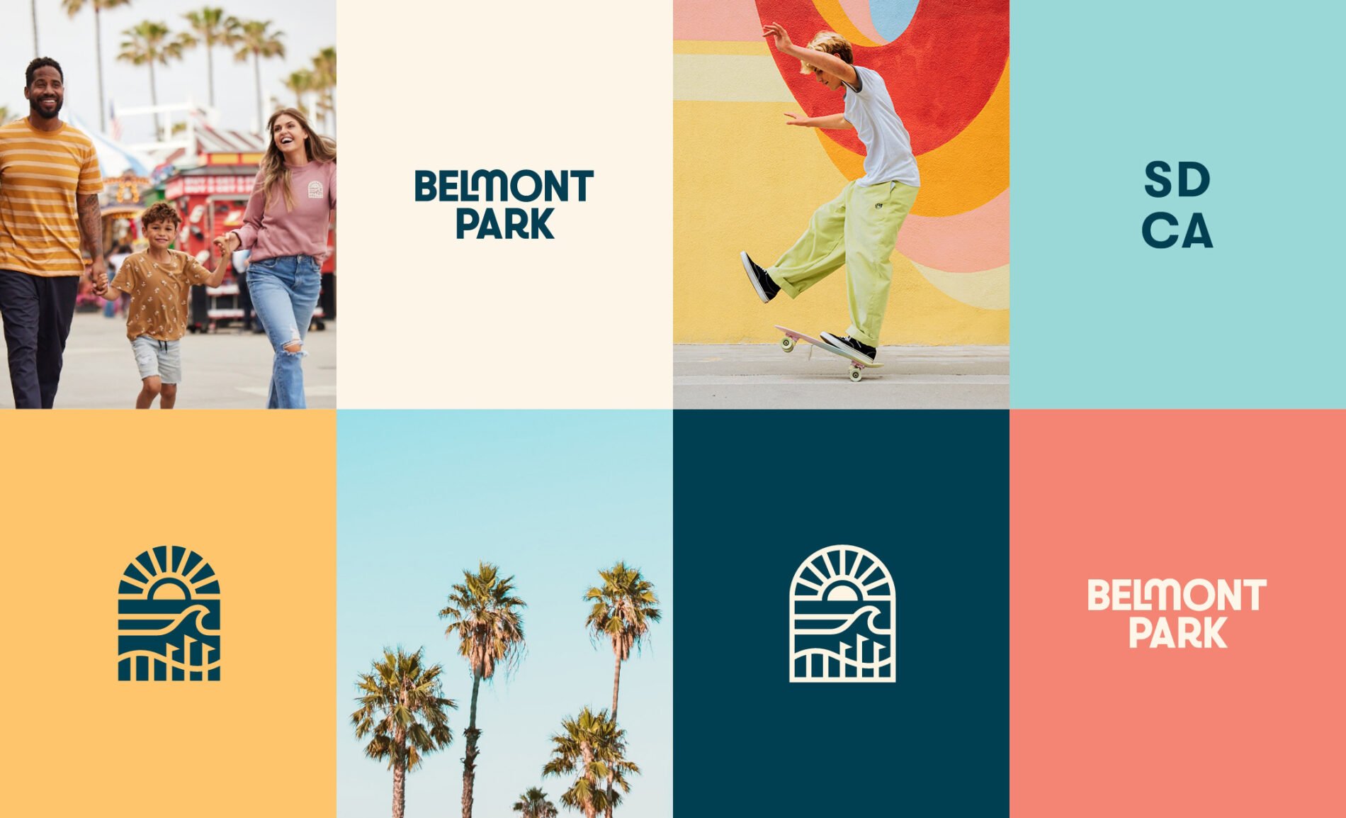
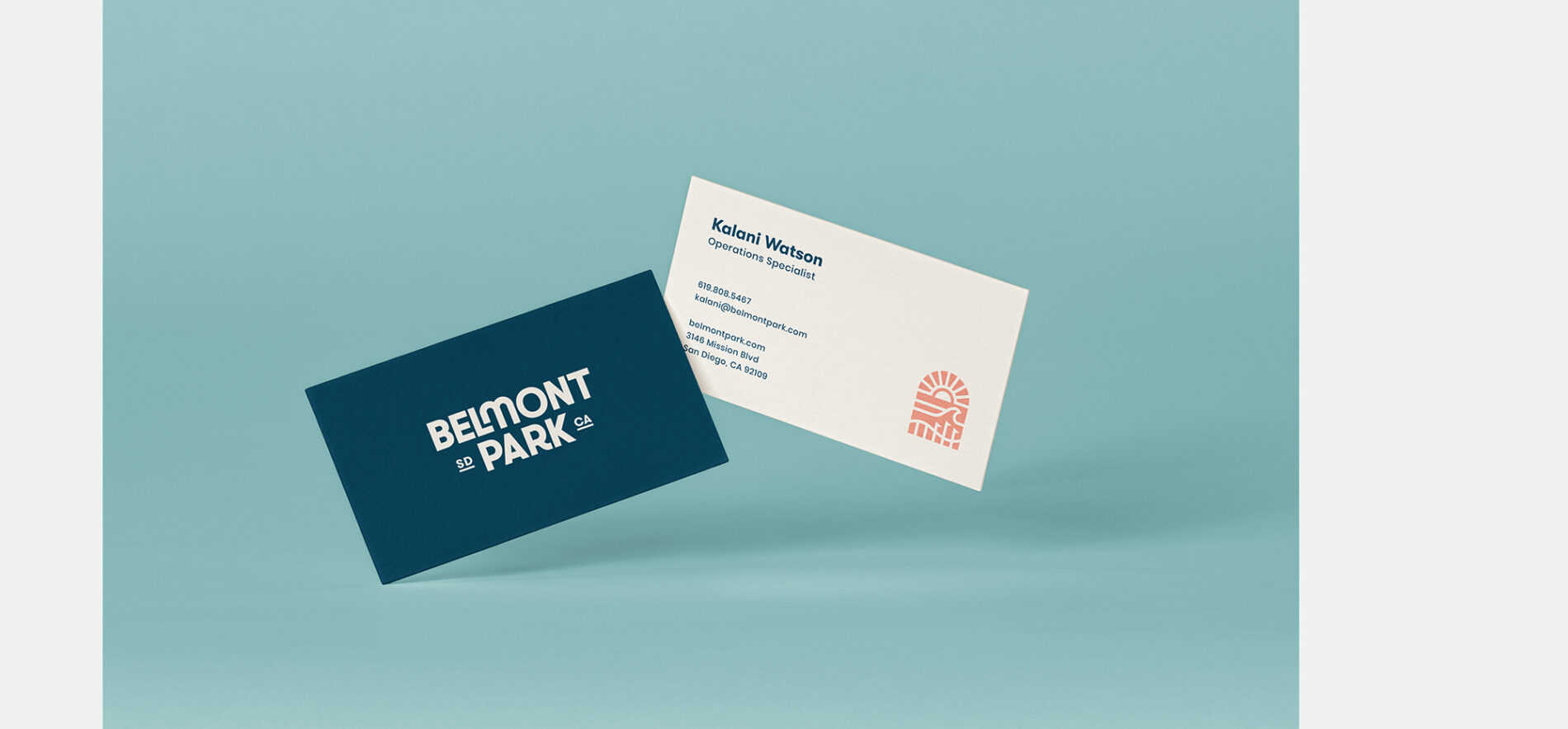
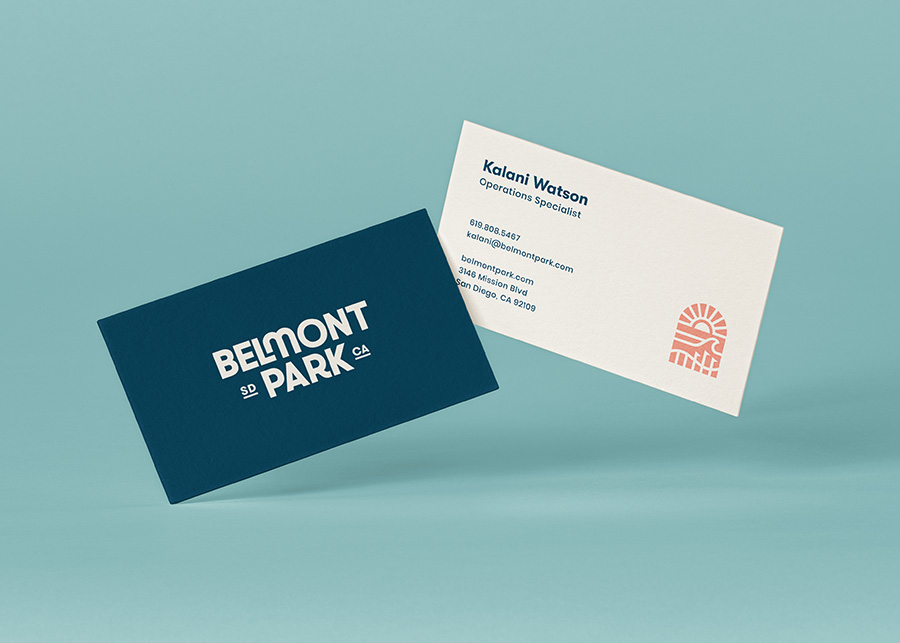
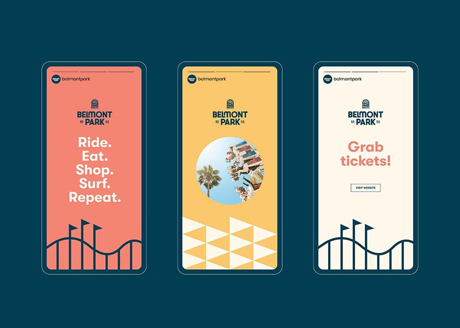
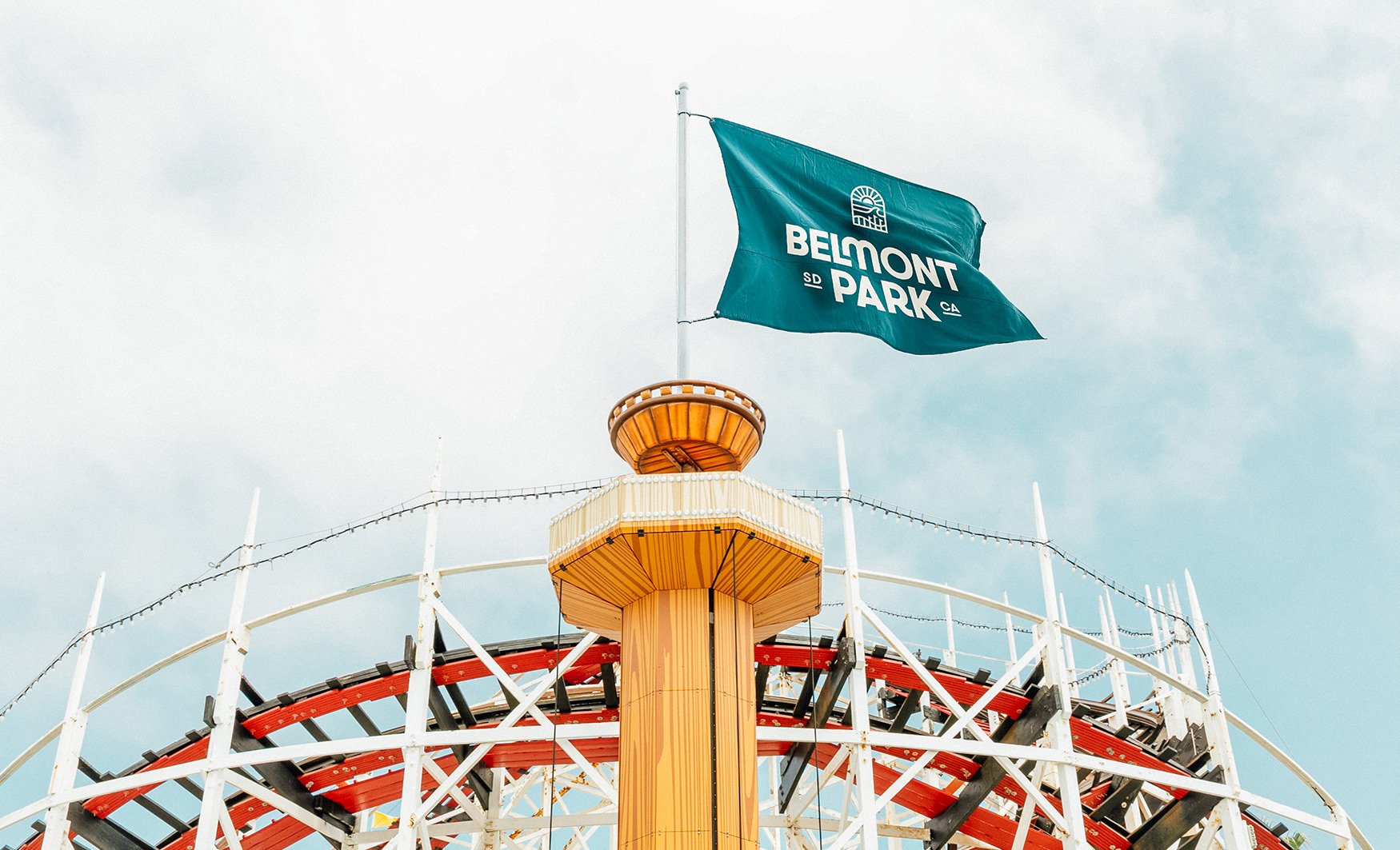
We started by anchoring our approach to Belmont Park’s brand belief that San Diego’s culture is unique, extraordinary, and deserves to be shared. We crafted a brand territory that positions Belmont as the Gateway to San Diego, and from there developed an identity that balances the best of the past and future. The arch shape of the icon symbolizes Belmont’s role as a gateway to all that San Diego has to offer. The interior depicts the iconic Big Dipper coaster ride and beachside location in a visual style that nods to the park’s legacy in the skate and surf scene from the 1960s to the present day. The wordmark shares this same balance, with bespoke curves nodding to iconic rides like the Big Dipper and evoking the whimsy and fun of 1960s design. The brand is rounded out by a modern, clean, and simple design system.
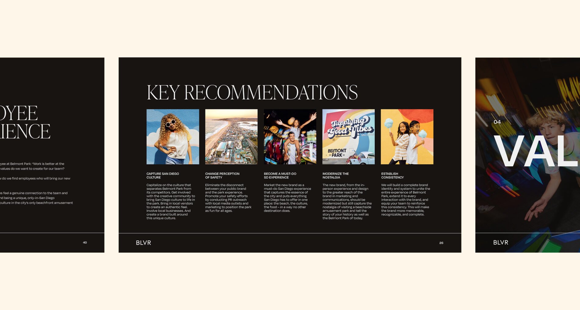
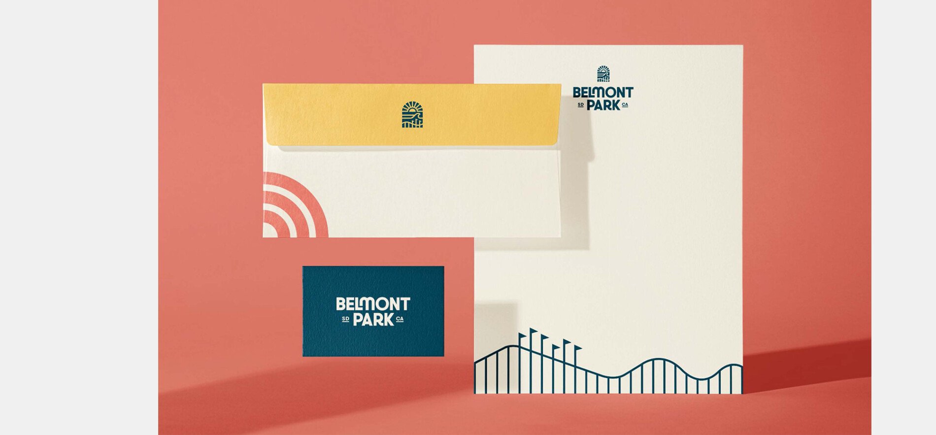
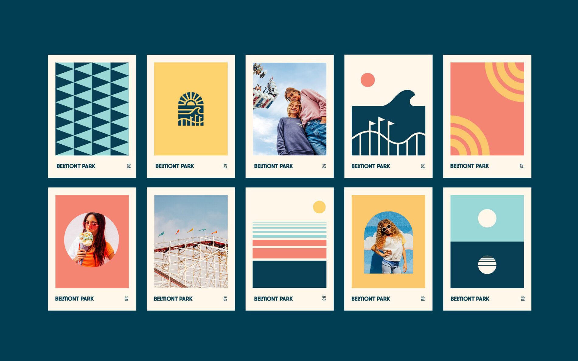
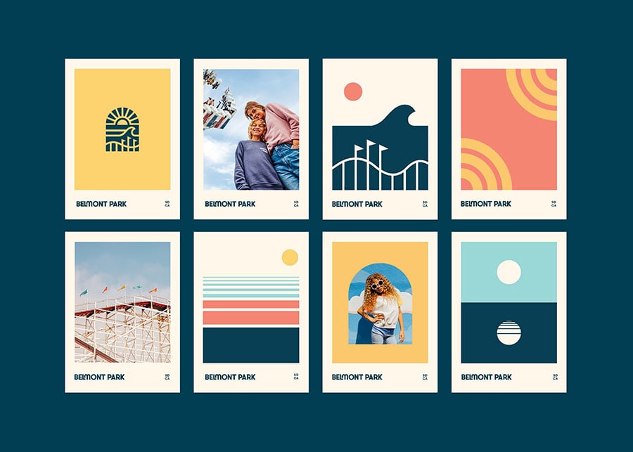
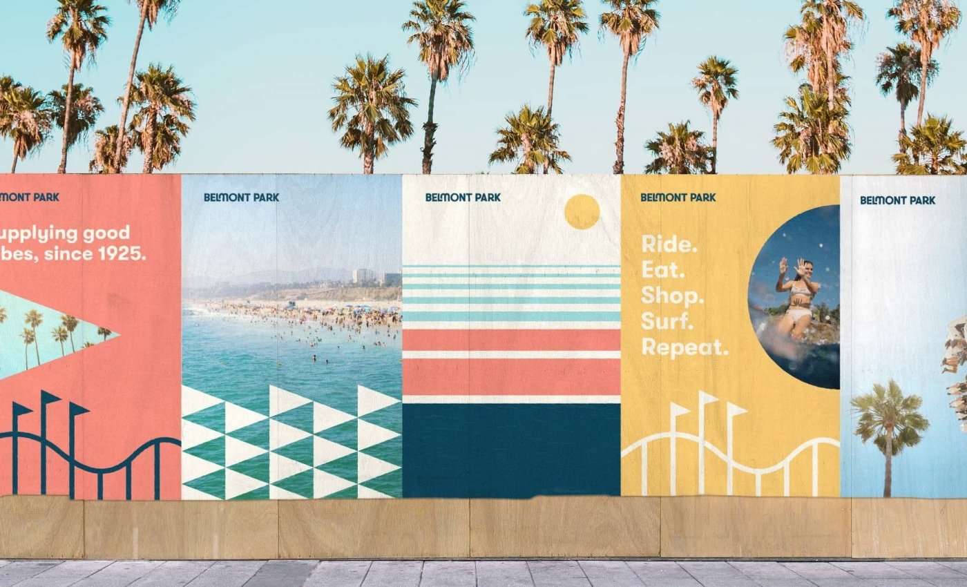
To develop a visual brand language that captured the essence of the park, we turned to its experience. We wanted to capture Belmont’s energy and optimism with a bold and vivid color palette, inspired by the vibrant colors of the park and the natural landscape of San Diego. We drew shades from the sand, sun, sky, and water, which resulted in a cohesive and recognizable palette. Additionally, we created a modular secondary illustration and pattern library that can be used across all brand touchpoints from website, collateral, and park signage.
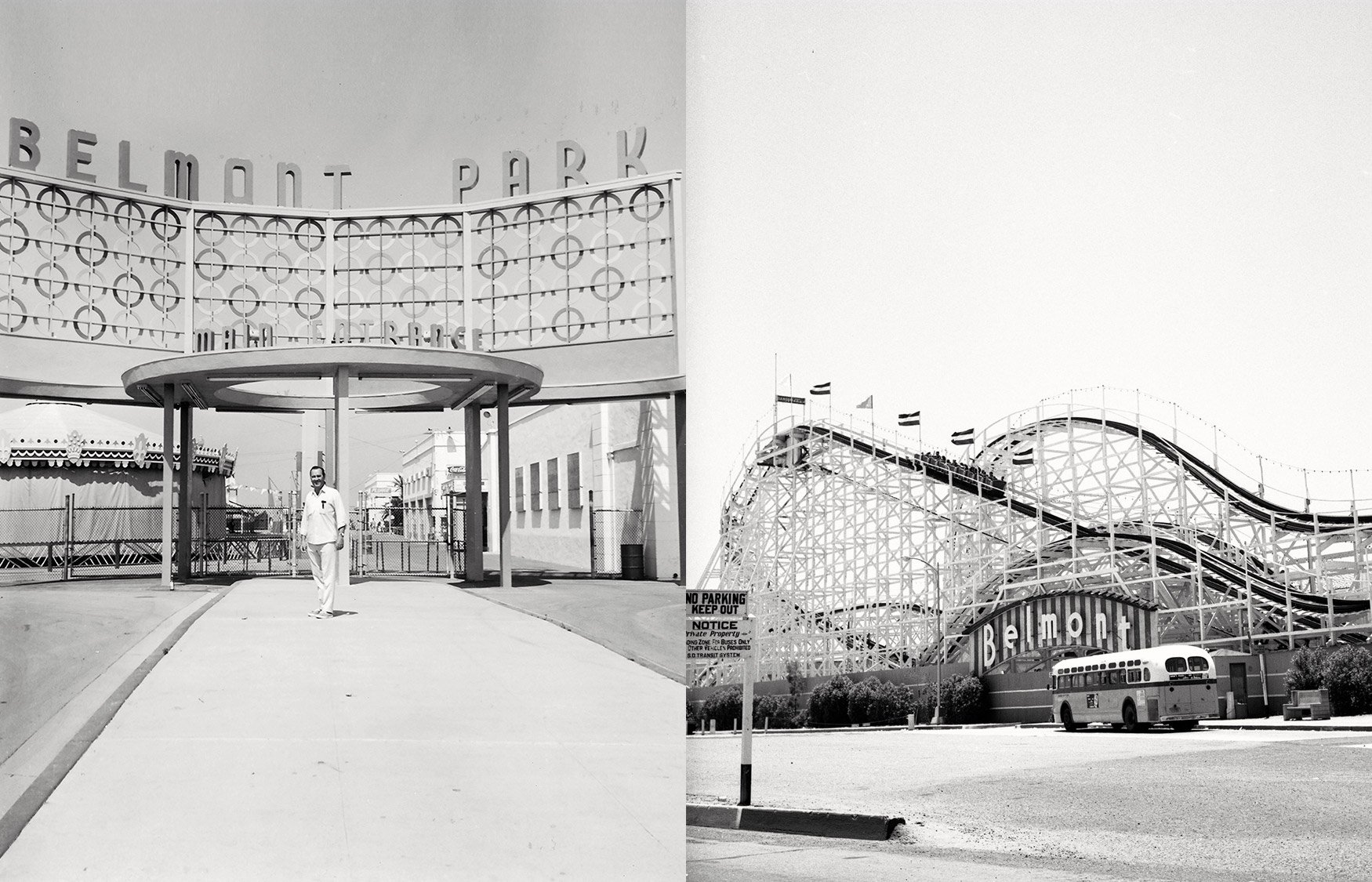
Our branding approach was rooted in authenticity, paying homage to Belmont Park’s rich history and San Diego’s unique cultural heritage.


