IS YOUR BRAND
LIVING A LIE?
FIND OUT NOW
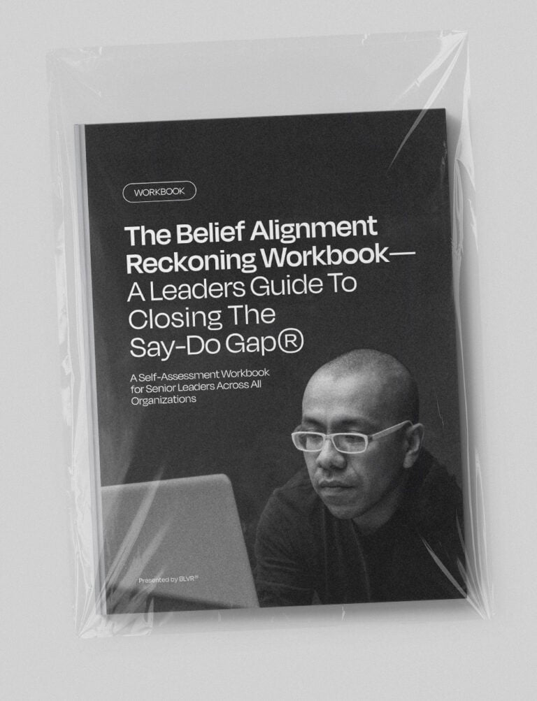
The Belief Alignment Reckoning:
A Leadership Self-Assessment
67% of consumers abandon brands after one trust breach.
Is your organization at risk?
This high-stakes workbook reveals the costly gap between what your organization claims to believe and what it actually does. In just 45 minutes, uncover where your actions contradict your words—and get a concrete roadmap to build authentic trust.


