Honeybloom


Overview
01
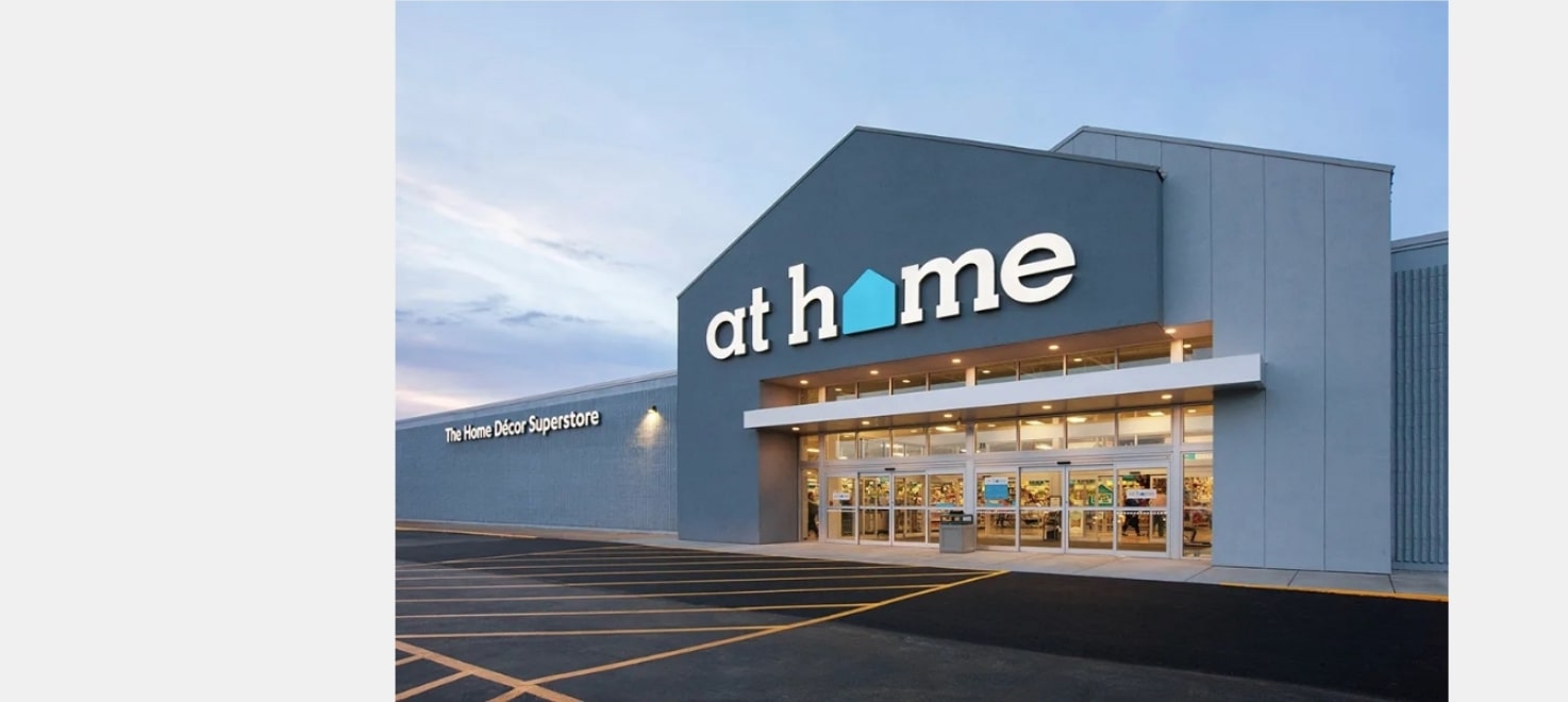
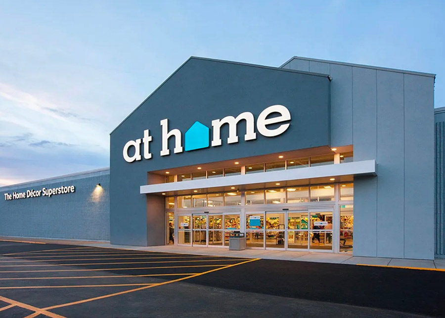
For the past eight years, billion-dollar retailer At Home has been providing shoppers with a vast selection of decor at amazing prices. While they have succeeded in building a well-known superstore, the Plano, Texas-based company’s next step was to create their own private label. With an established home decor brand, along with collaborations with high-profile designers, At Home needed a way to invite their new label into their ecosystem. BLVR took the challenge and helped At Home shape its vision by constructing the new identity, Honeybloom, to create a seamless private label brand fit within the overarching At Home parent brand.
Brand Strategy
02
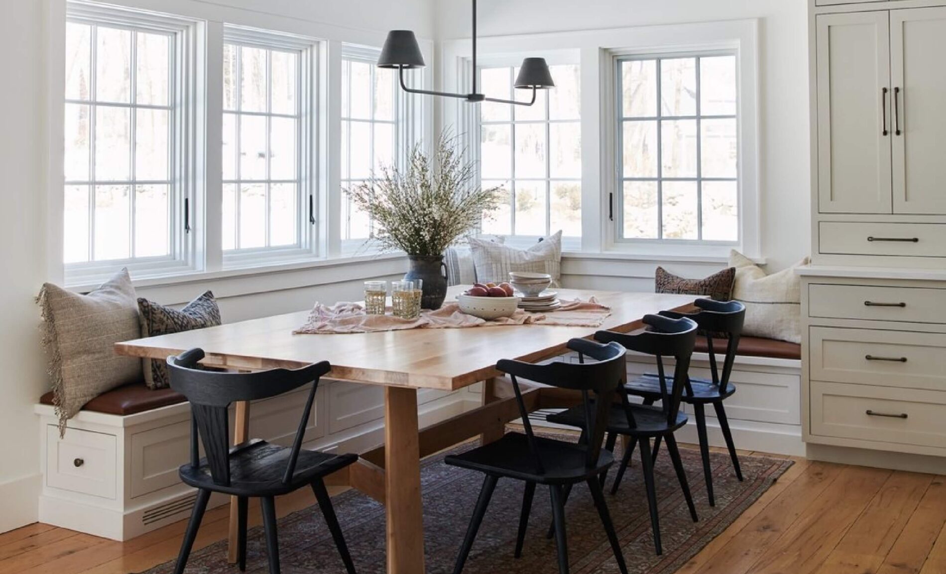
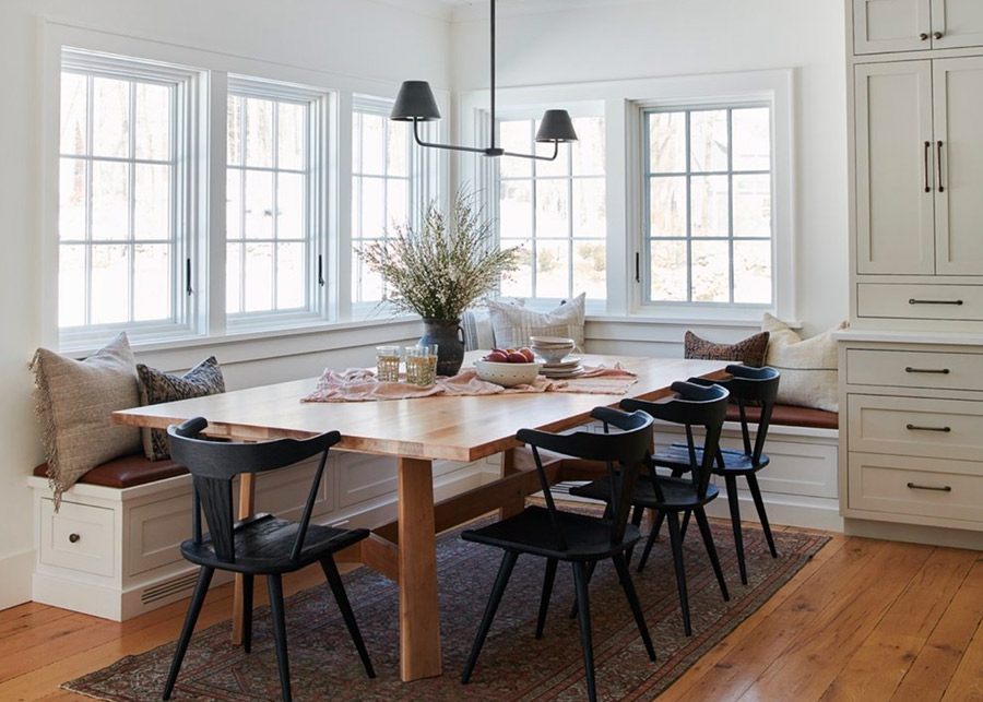
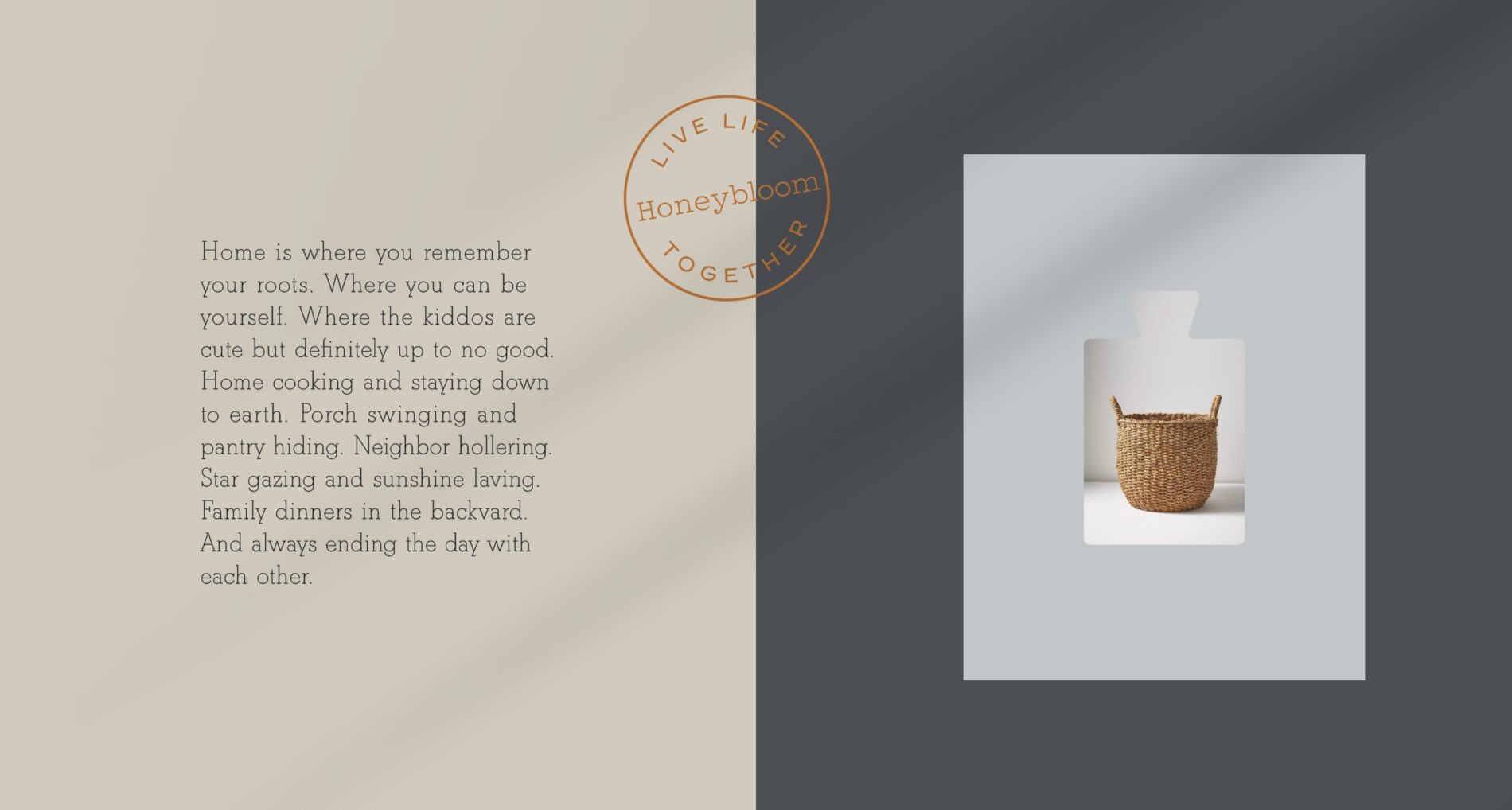
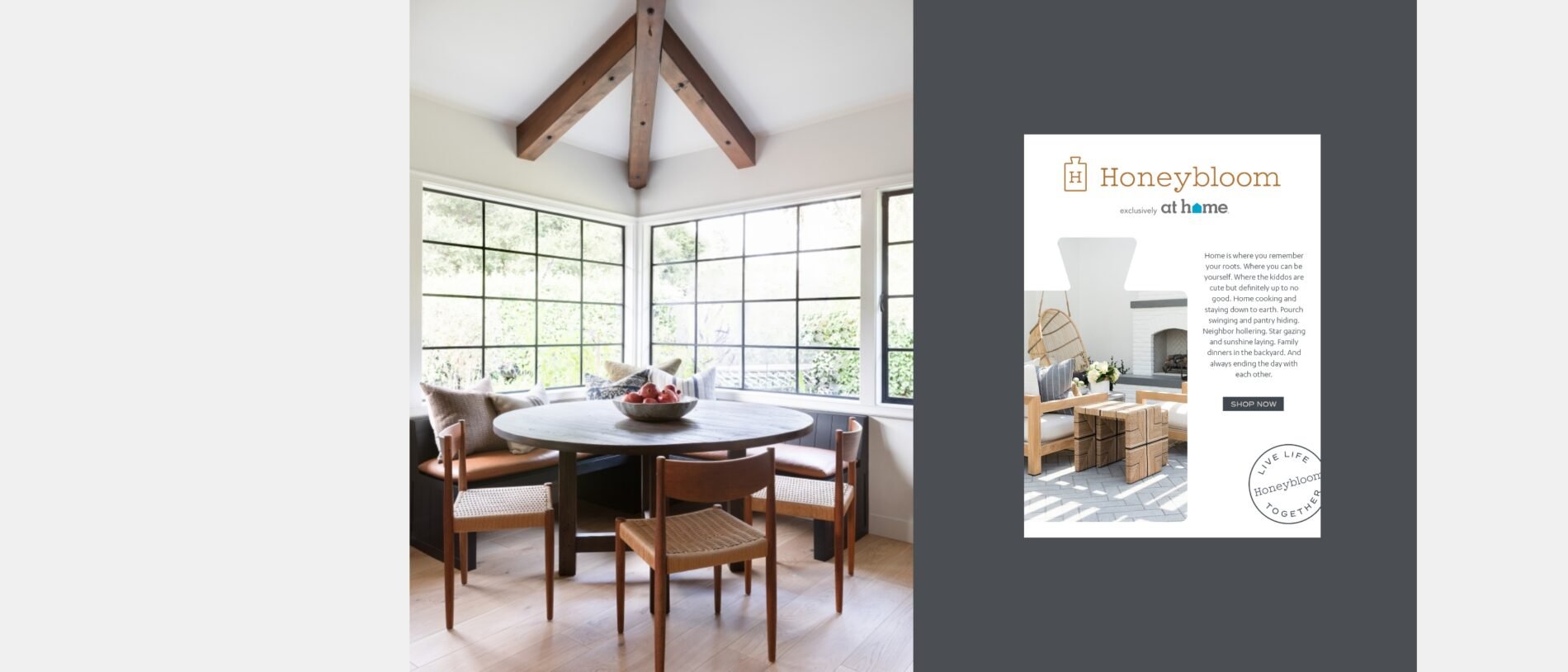
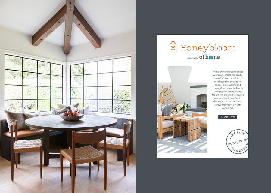
As we dug into the brand, we first had to understand who the consumer was and what their goals, aspirations, and vision were when they are searching for that perfect element to complete their home. At Home had built out incredible personas that captured the essence of who the Honeybloom shopper was. We then crafted the concept around the idea that we live life together. Home is where you remember your roots. Where you can be yourself. Where the kiddos are cute but definitely up to no good. Home cooking and staying down to earth. Porch swinging and pantry hiding. Neighbor hollering. Star gazing and sunshine living. Family dinners in the backyard. And always ending the day with each other.
NAMING
03
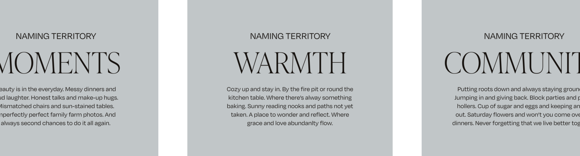
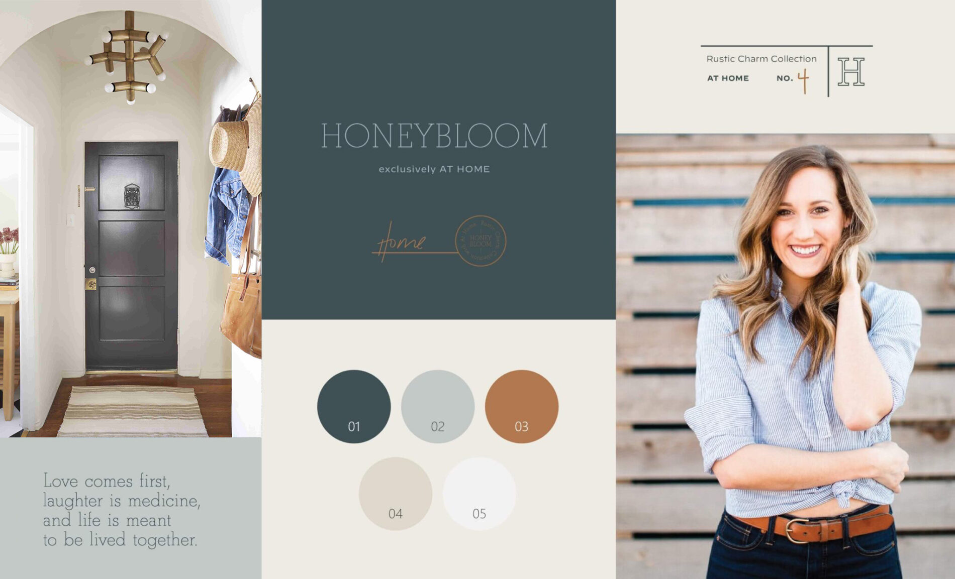
As one aspect of our brand development partnership with At Home, we were tasked with creating a name for the label under the At Home umbrella. Our process starts with establishing “buckets,” categories that exemplify the characteristics of the brand. Our first bucket was Moments, the special instances in the home that are most memorable. The second was Warmth, the tangible feeling of being perfectly content in your abode. Last was Community, the sense of belonging that comes from deep roots and loving together. Each bucket contained several possible names that perfectly encapsulated each characteristic of the brand. Through our process of ideation and elimination, we researched and accounted for trademark and domain availability, along with carefully considering cultural impact and any other factors that would affect the brand inception. The result was Honeybloom, a name that evokes the comfort and connection of being together.
CREATIVE TERRITORIES
04
Our next step was to establish an art direction for the brand. Tying in the feelings of homegrown comfort and security was important while creating the visual aspects of Honeybloom. We established three distinct creative territories that each represented Honeybloom in a unique way that were all connected to the themes of the brand. After feedback and collaboration, we finalized an artistic direction that immediately instilled feelings of ease and comfort, like a spoonful of your favorite home-cooked meal.


BRAND IDENTITY
05
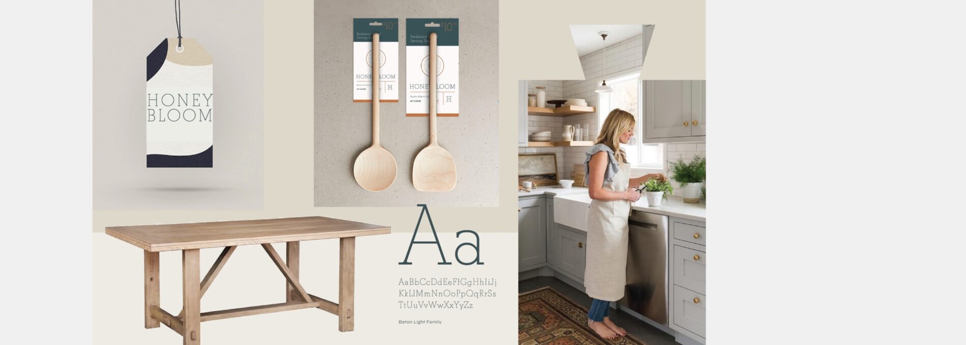
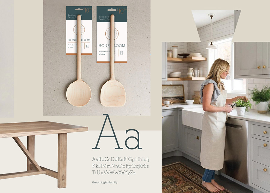
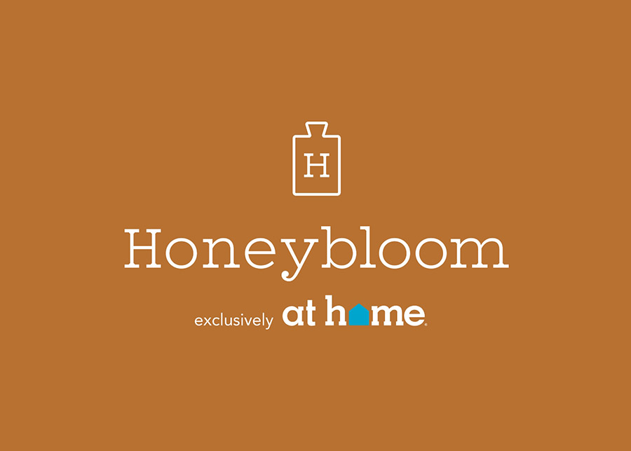
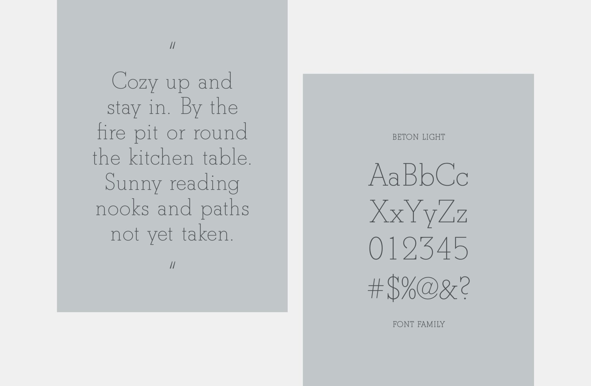
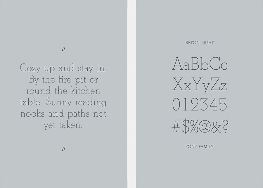
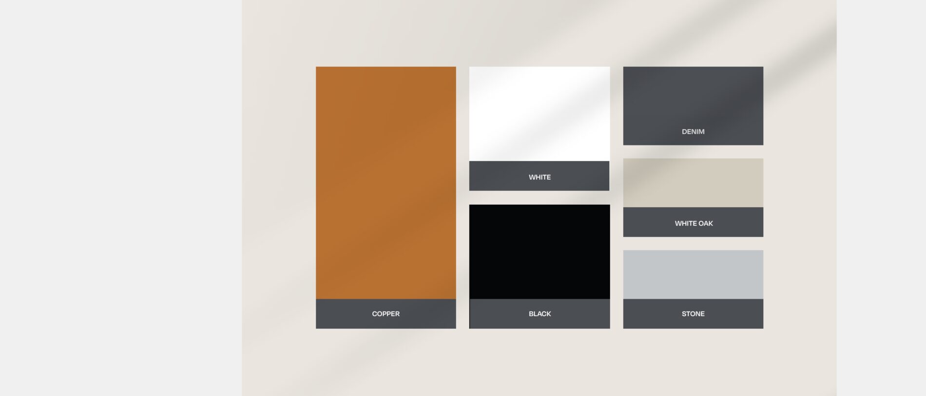
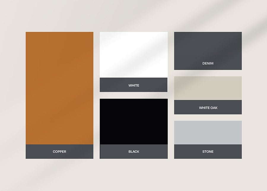
To fully form the brand identity, we put all of the pieces in place to solidify Honeybloom as a brand that lives to love and stays grounded in the simple things that make life so sweet. The color palette consists of a primary copper, complimented by denim, stone, and white oak. The tone of the brand is hospitable and caring, highlighting the aspects of the home that bring the family together. We created a simple logo with the outline of a wooden cutting board stamped with an earnest H. The typeface is effortless and timeless, welcoming with open arms. All aspects of the Honeybloom brand pair perfectly with the other distinct brands in the At Home family, while focusing on the brand’s core idea of “Live Life Together.”

ad like objects
06
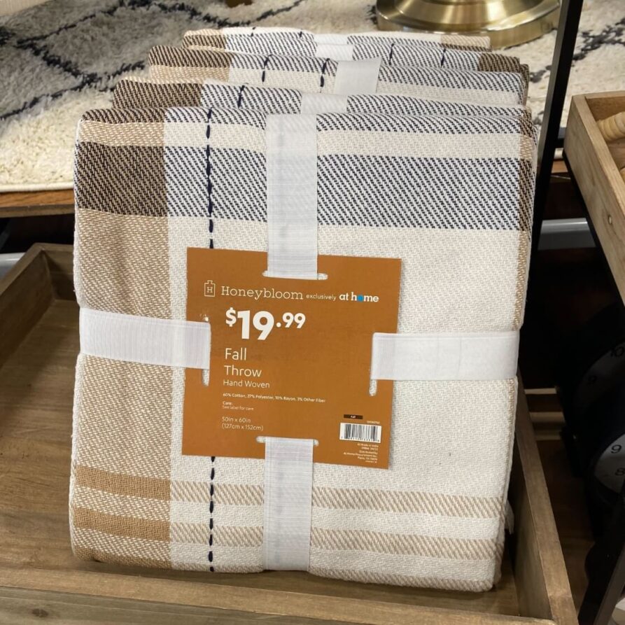
Brand Activation - Packaging
07
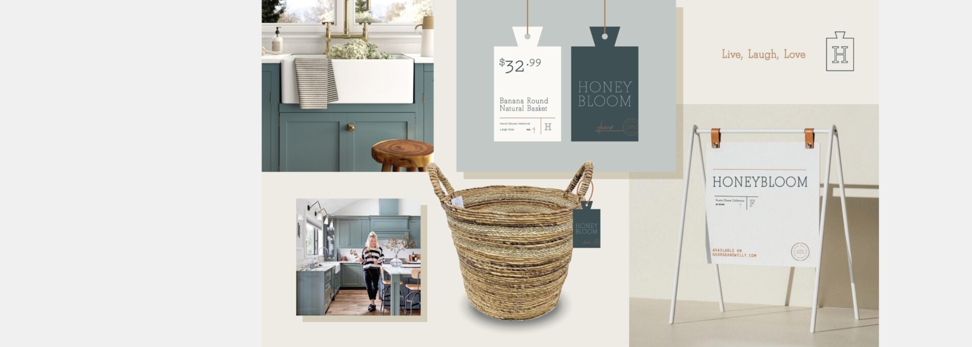
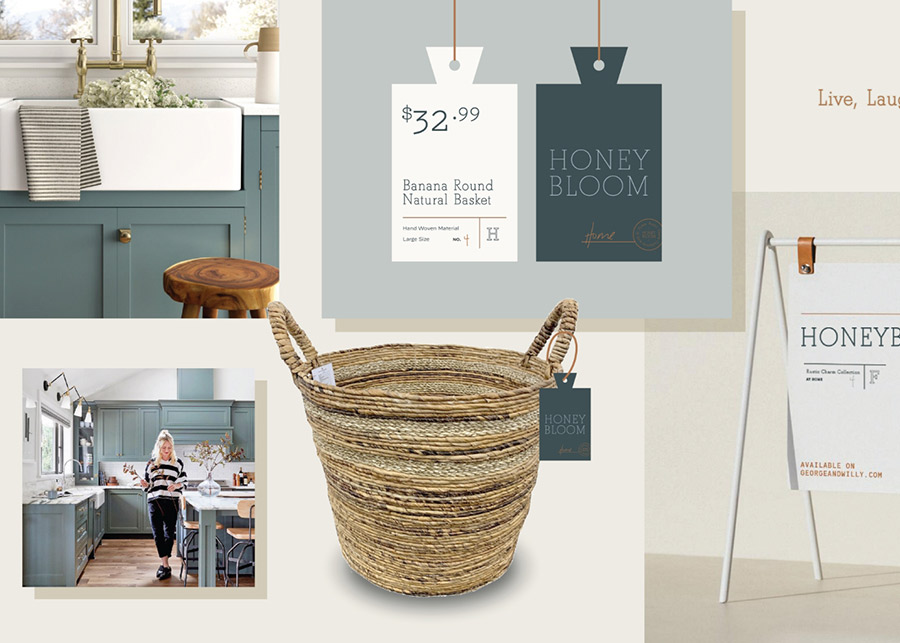
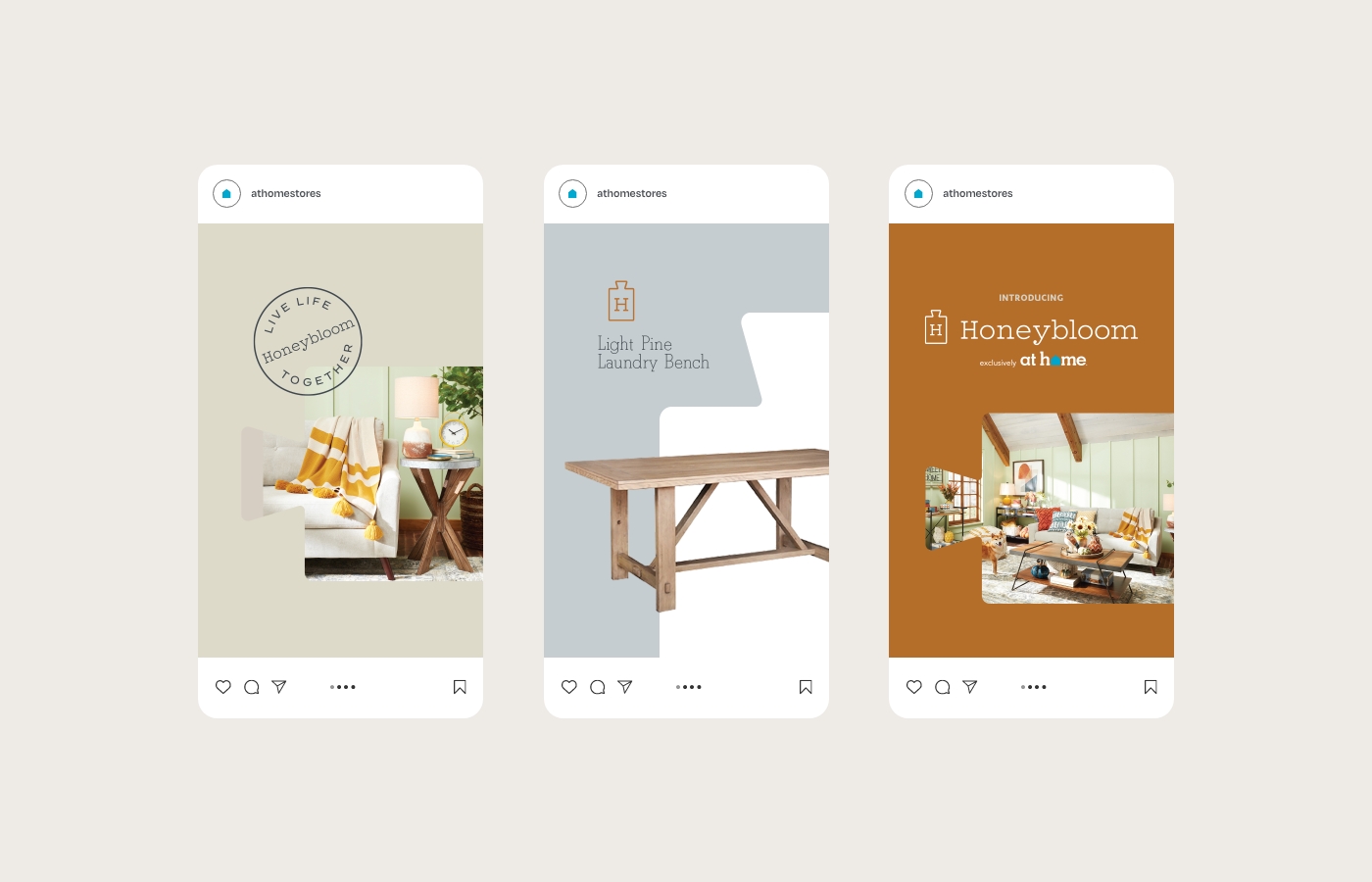
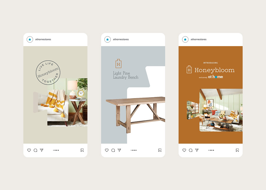
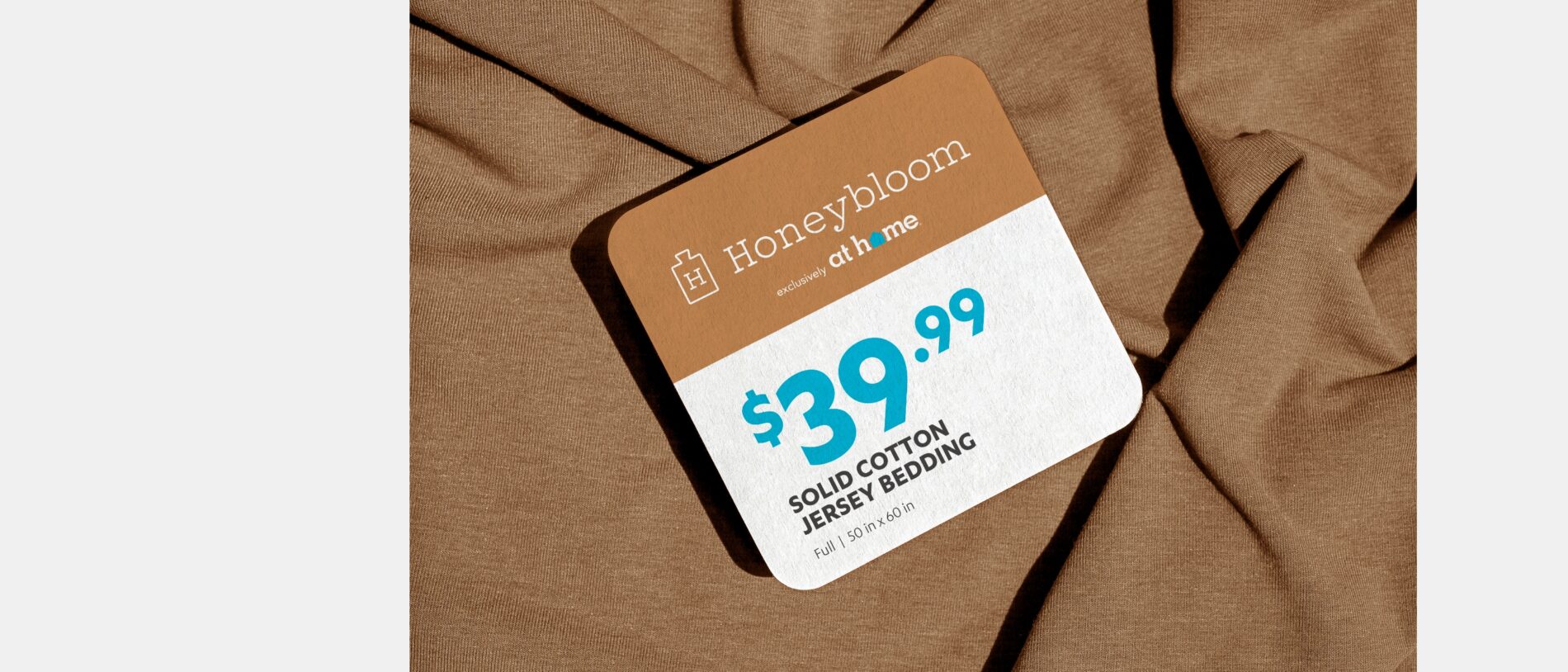
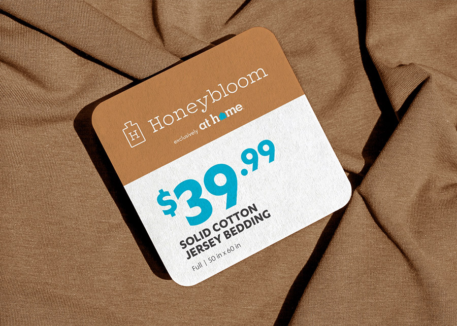
The packaging for the Honeybloom line was humble and honest, capturing the attention of home designers with clear price points and straightforward copy. At Home is dedicated to keeping its products affordable and accessible, so we also created an adaptable tag that can be removed and replaced based on the current retail price of each product. We designed a number of packaging options, from hang tags and inserts to boxes and table runners, each of which inspires all of the emotions of the Honeybloom identity.
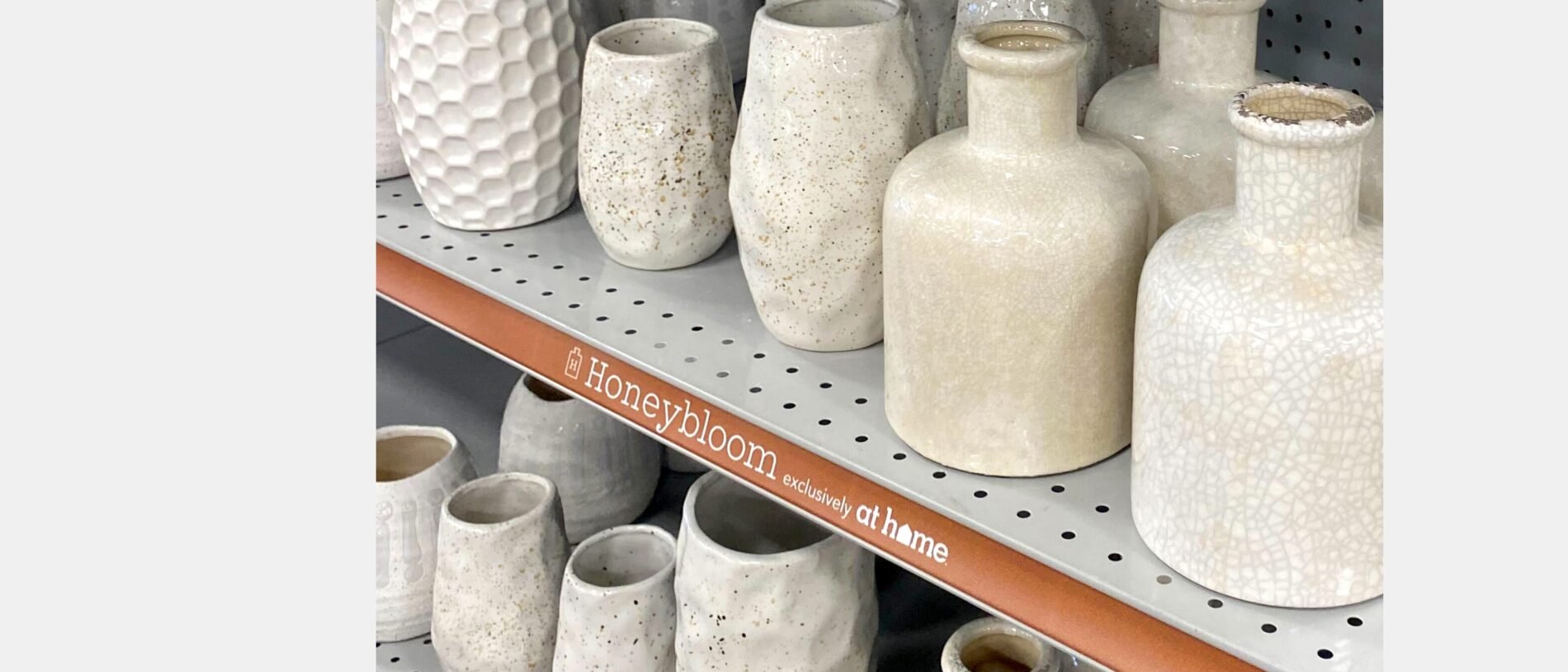
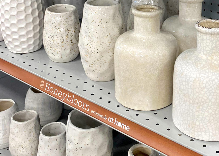
Brand Activation - In-Store Display
08
In-store displays are key to building awareness and loyalty while initiating a new brand. We produced signage that would elicit the themes of the Honeybloom line of products while catching the eye through the aesthetics of the design. The logo’s outline becomes a window into the down-to-Earth lifestyle of a Honeybloom home, with each sign showing a different image of ease. Simplistic shelf strips promote the Honeybloom brand with a pop of copper. Social and print utilize the color palette and all the design aspects in a way that is unique to the brand and its roots in authenticity. Altogether, the pieces create an ecosystem of familiarity, blanketed by the comforting feeling of togetherness.