Oh
Overview
01
As an organic cold-pressed juice bar, Organic Health’s (OH) business was built on quality, but they were having trouble scaling in a crowded market where customers had been trained to accept cheaper inferior products. They challenged rood and beverage branding agency, BLVR to change the narrative around the importance of quality and build more value into the OH brand and what it stood for. We crafted a new brand positioning, identity, packaging, and website based on the notion that eating wasn’t just a necessity; it was a means to live your best life.
Brand Strategy
02
Consumer research identified that our target audience treated eating as a form of self-respect. It reflected how they saw themselves and their world. A clean, organic, microbiome-friendly diet changed how they saw themselves and the world around them, and it gave their body the fuel they needed to be the best version of themselves—physically, mentally, and spiritually. These were the type of individuals who truly cared about not compromising on quality because they understood the far-reaching benefits.
Brand Identity
03
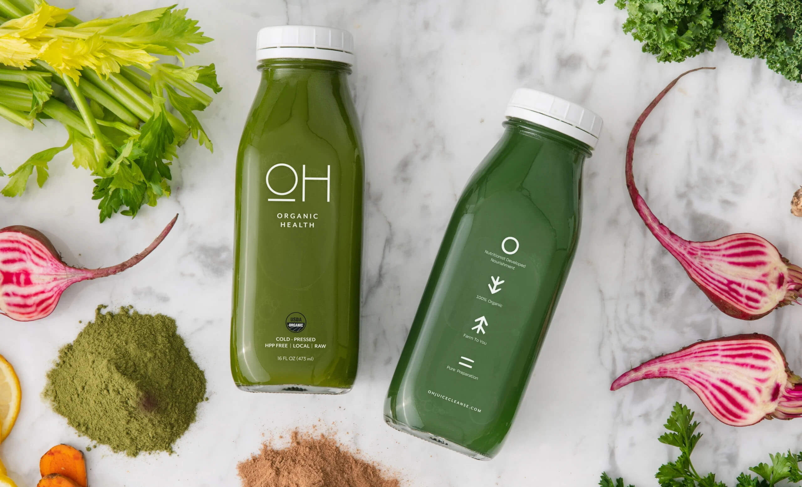
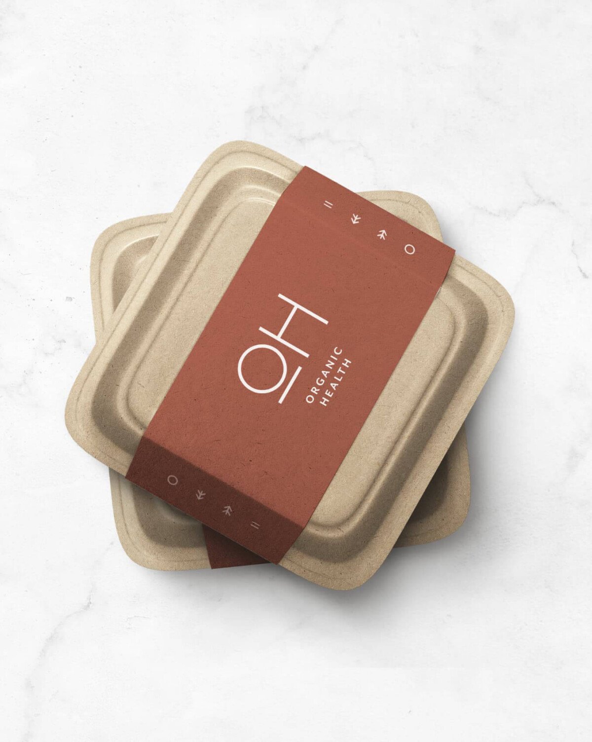
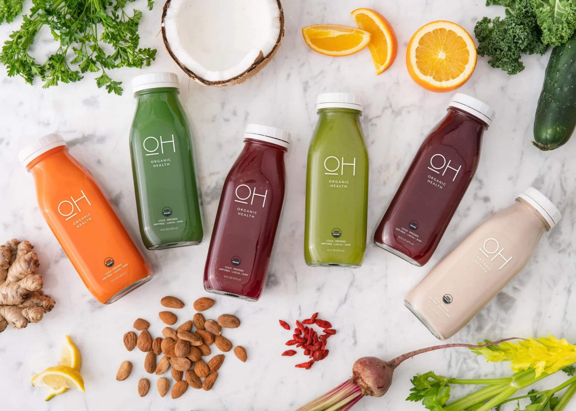
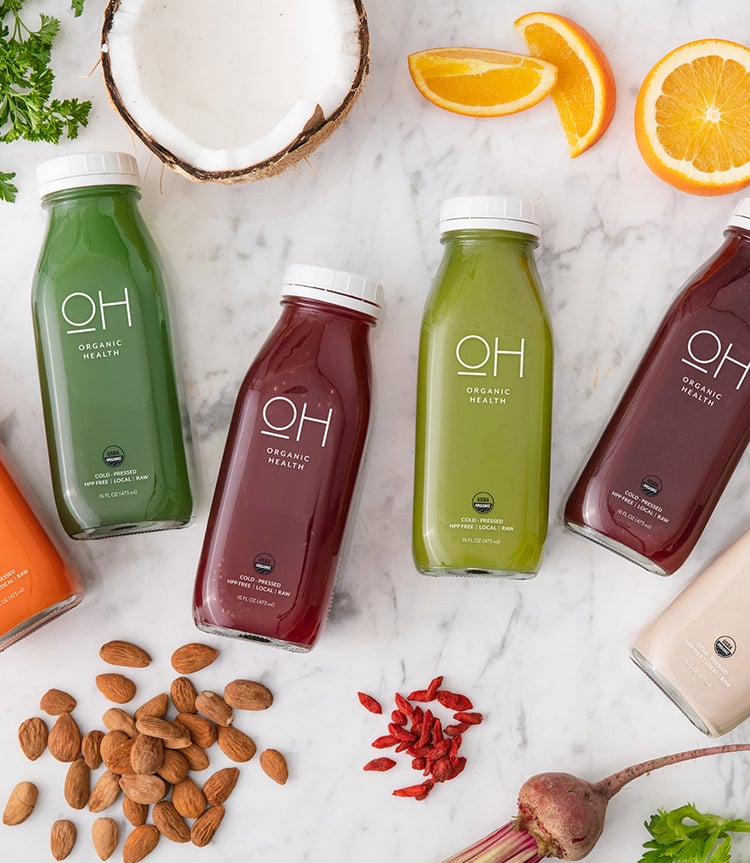
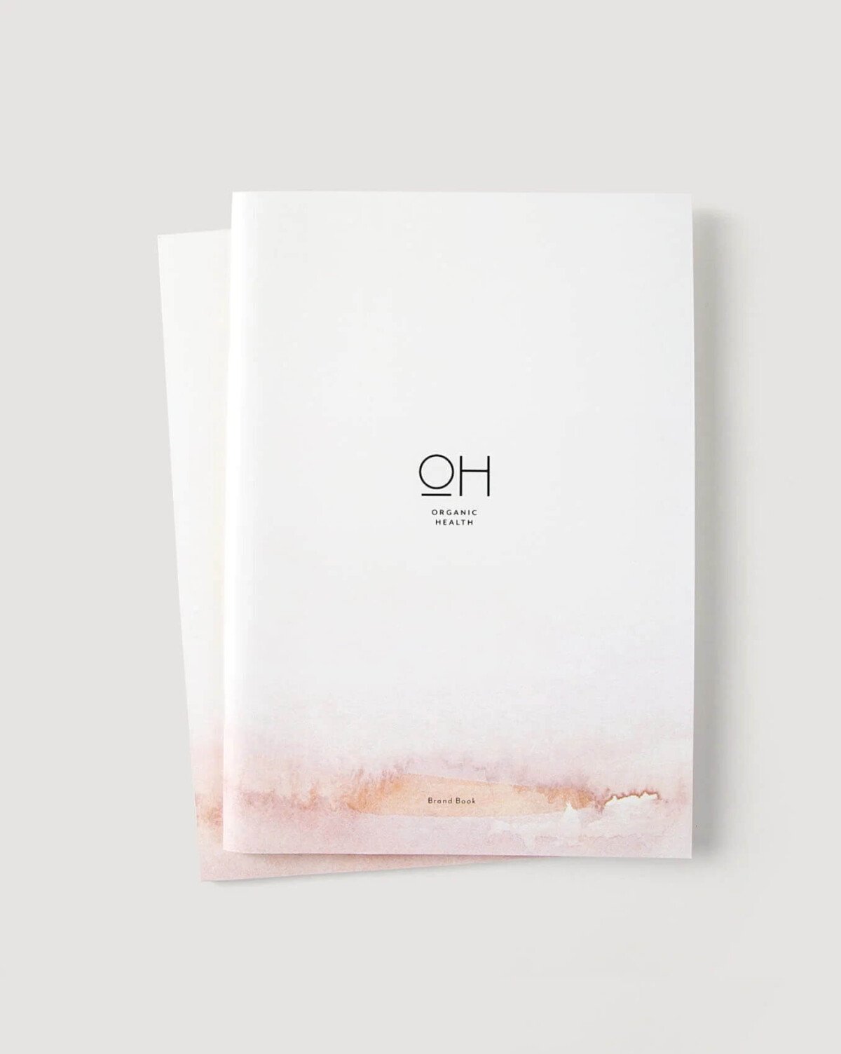
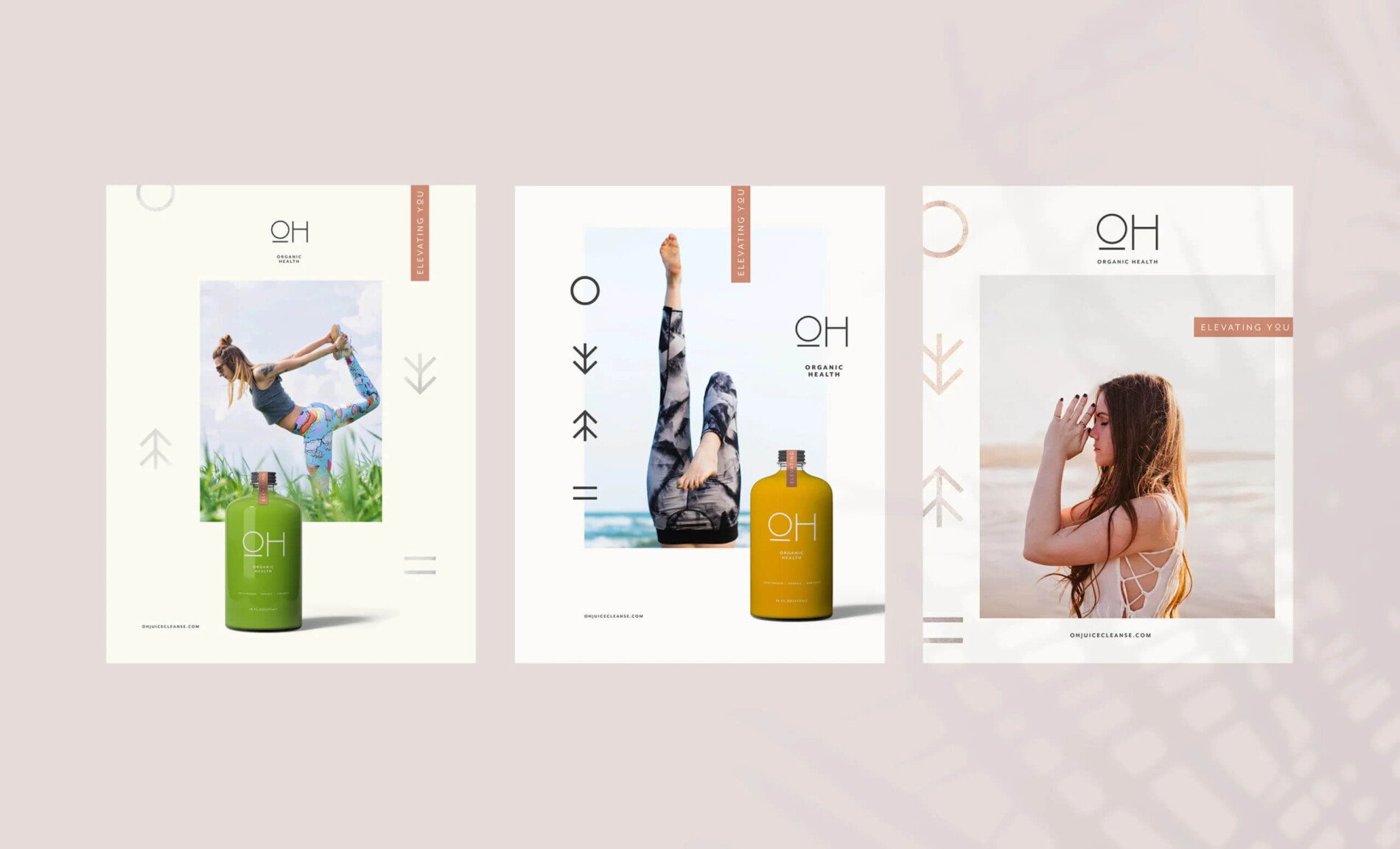
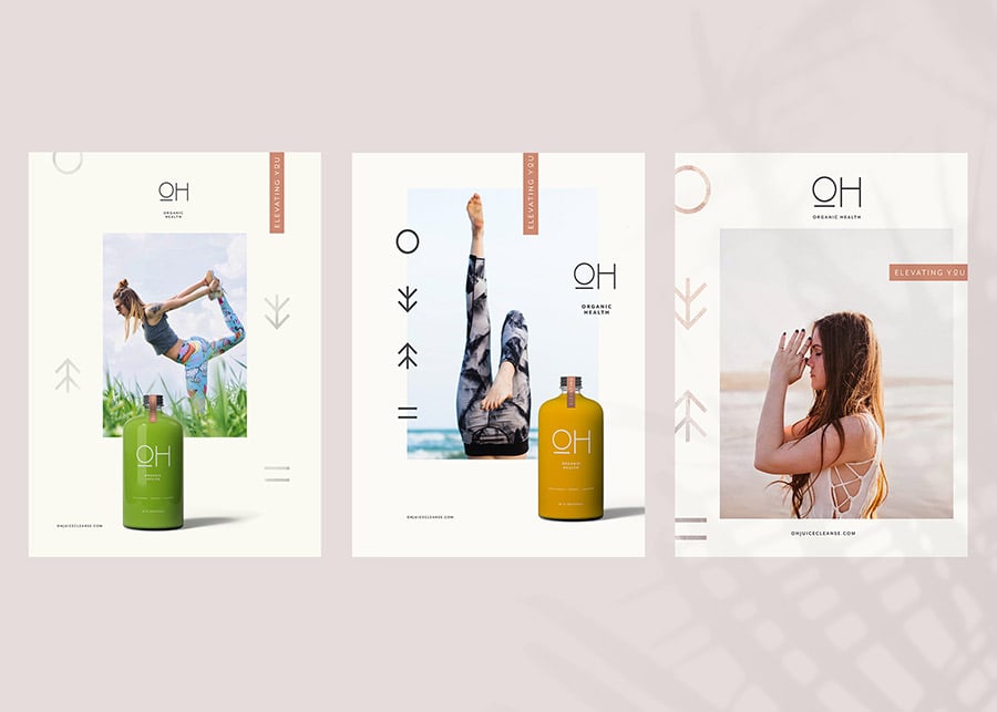
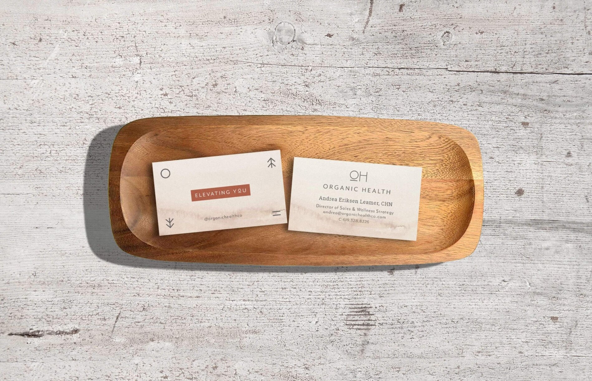
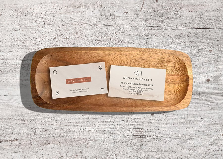
To modernize the brand and reflect their emphasis on quality, we created a simple icon based on the letters of the name: OH. We added a bold line under the “O” to resemble a person and underscore our focus on helping people become the best version of themselves. The circular “O” combined with the linear “H” helps to represent the balance we’re all seeking in life, between physical, mental, and spiritual health, and the role that OH can play in helping you achieve it.
Brand Identity
04
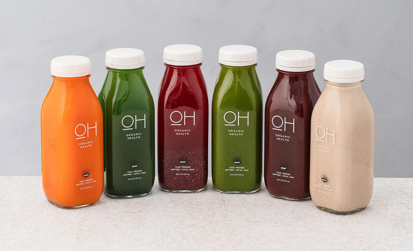
Because OH is an organic, health-focused brand, we wanted to ensure the color palette felt grounded in neutral earth tones. We selected a soothing mix of ivory, charcoal, champagne, and ebony as the primary brand colors. Our secondary color palette consisted of slate blue, sage, mushroom, blush, and copper to convey a sense of warmth and wellness. When it came to fonts, we selected a mix of warm, inviting typefaces, including Mr Eaves Modern OT, a modern sans serif for headlines, along with Roboto Slab, which combines geometric forms with friendly and open curves. Finally, we selected Golden Plains, an expressive and emotive handwritten script used for accents.
Brand Experience
05
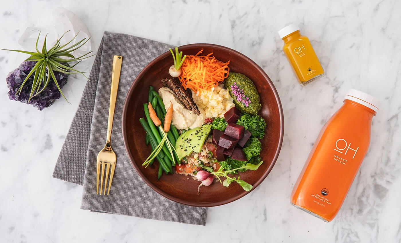
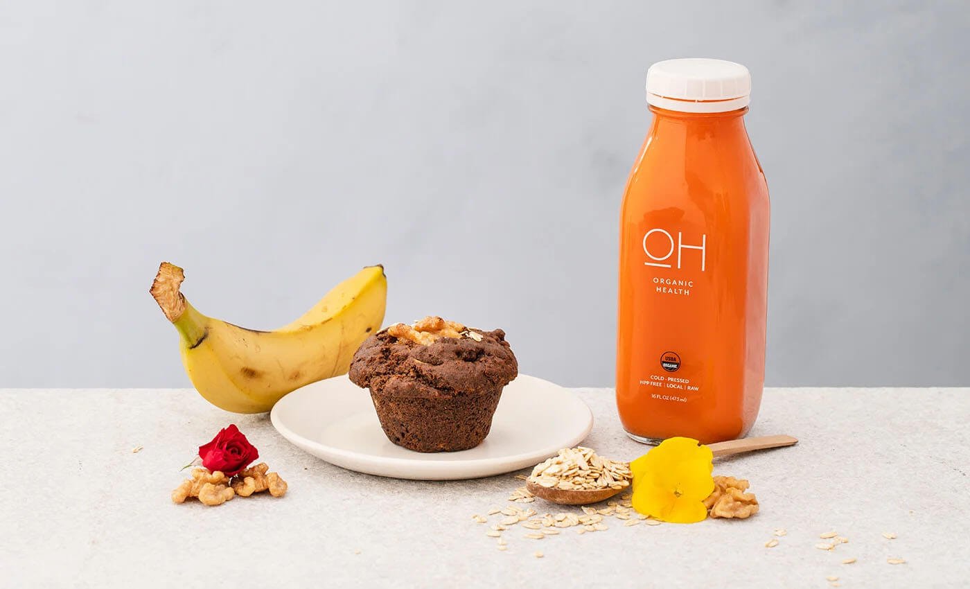
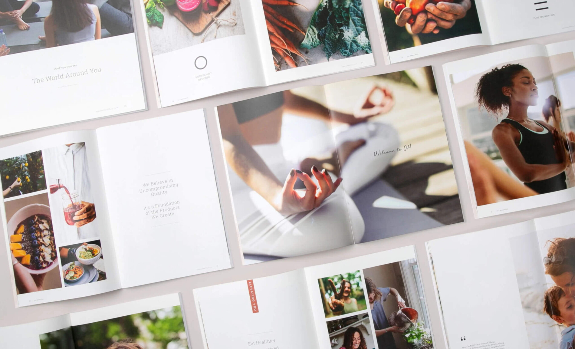
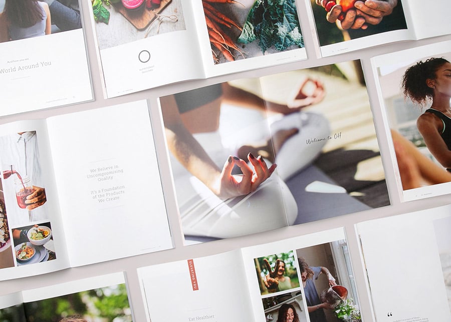
The final stage of rebranding OH involved bringing their uncompromising quality to life via packaging. We created a consistent look and feel through the use of subtle watercolor backgrounds and a series of unique icons that represented OH’s proof points, including nutritionist-developed nourishment, 100% organic farm to you, and pure preparation. The simplicity of these designs, paired with the inviting OH logo, helped the brand feel warm, approachable, and quality-led across all elements from, the juice bottle to carry-out bags and boxes.